



Orange
- the introduction
- Physiological properties of orange color
- History and culture related to orange color
- Error 500 (Server Error)!!1500.That’s an error.There was an error. Please try again later.That’s all we know.
- Error 500 (Server Error)!!1500.That’s an error.There was an error. Please try again later.That’s all we know.
the introduction
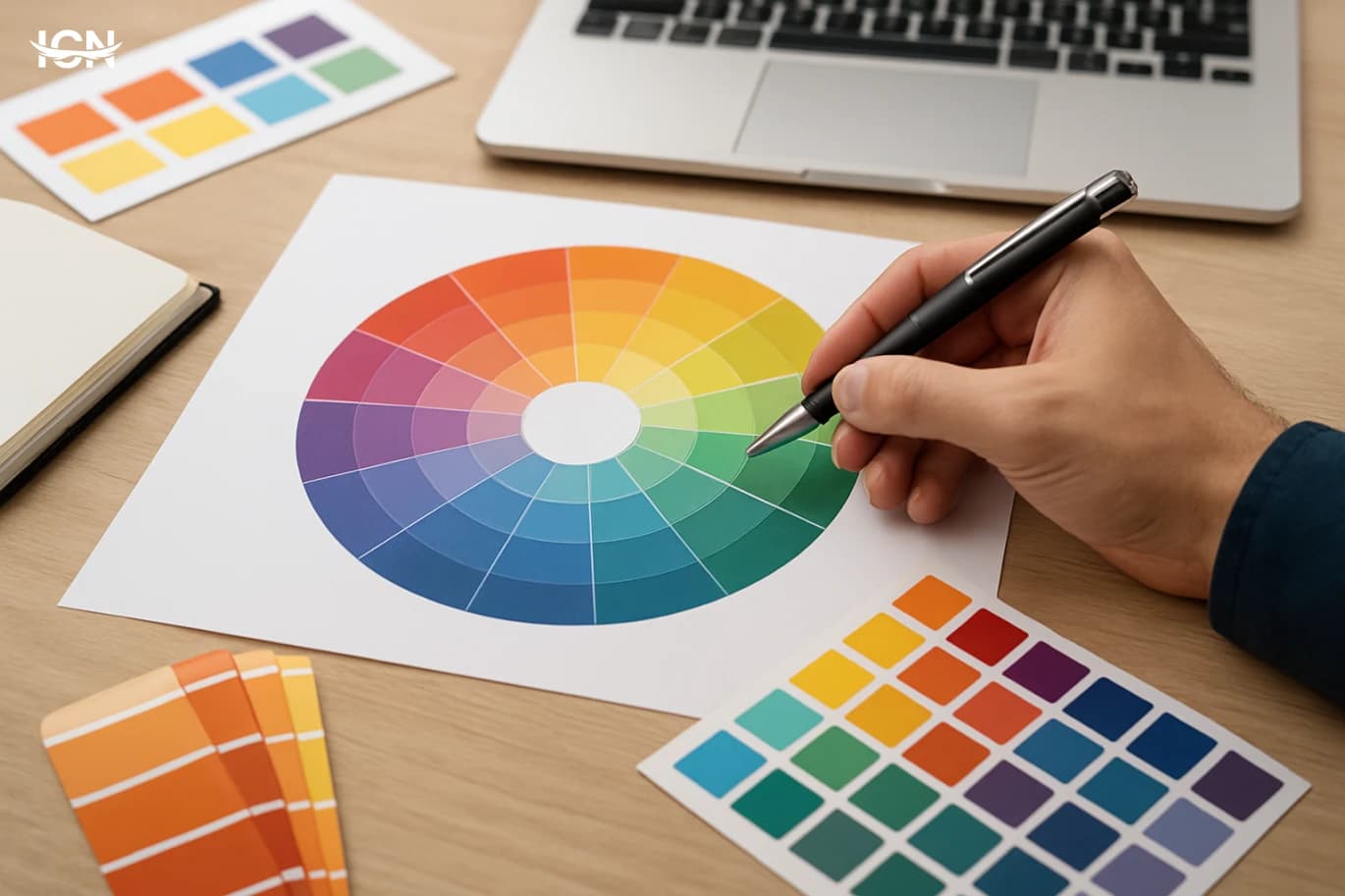
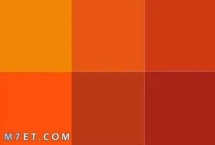
Orange: The definition and origin of orange is a warm colors and mixes the energy in the red and joy provided by yellow. Orange symbolizes creativity and enthusiasm, and has appeared in various cultures throughout the ages, used in engineering arts and decorations. The importance of orange color in art and design The orange color plays a pivotal role in art and design, as it helps to attract attention and create a feeling of warmth and comfort. It is used in the design of slogans and websites to generate a feeling of positivity and activity. It also contributes to enhancing innovative spirit and effectively reflects the sense of emotional emotions, making it a common choice among many designers.
Physiological properties of orange color
Psychological and emotional effects of orange color The orange color has positive psychological effects on individuals, as it enhances the feeling of happiness and warmth. It reflects vitality and activity, which makes people feel positive when seeing it. For this reason, it is used in many events and events to enhance morale. The uses of orange color in nature and the environment is common in nature in nature, as it is seen in fruits and vegetables such as oranges and carrots. This color is also an indication of maturity and quality. The creation of nature by integrating orange is enhancing human experiences and reflects the beauty of the environment.
History and culture related to orange color
The role of orange in religions and traditions was the color of orange. Important connotations in many religions and cultures. In India, orange is associated with spiritual traditions, especially with Sufism. While in some cultures it is used as a symbol of celebration and joy. The orange color expresses harmony between the body and the mind and is considered a sign of strength and vitality. The development of orange color in various civilizations throughout the ages, used orange as a cultural slogan in different civilizations. In ancient Egyptian civilization, it was used in decorations, while the Romans used it in architecture and art. Today, this color continues to influence the modern world, as it is used in marketing and decoration.
Error 500 (Server Error)!!1500.That’s an error.There was an error. Please try again later.That’s all we know.
The effects of the use of orange color in building design The orange color is one of the attractive colors in the design of buildings, as it gives a feeling of warmth and comfort to the spaces. This color is used in building facades to reflect vitality and activity, and can also help create fun and encouraging environments for innovation. Tips for choosing furniture and decoration in orange when choosing furniture and decoration in orange, it is preferable to merge it with neutral colors such as white or gray to ensure an optical balance. It can be used in small details such as pillows or paintings, which facilitates the process of change and renewal in the place without the need for large costs.
Error 500 (Server Error)!!1500.That’s an error.There was an error. Please try again later.That’s all we know.
Promised artworks that use orange in an innovative way that are considered many famous artworks, such as the plates of impressionist artists, a great example of the use of orange color to embody meanings and feelings. This color embodies strength and vitality, making it a preferred choice for many artists who seek to create a strong visual effect. Drawing and photography techniques using orange color in drawing and photography techniques, orange color is used in a variety of ways to create contrast with other colors. It is used from its various degrees to highlight the shadows and lights, adding a warm and vital touch to the artwork. يُمكن أيضًا دمجه مع ألوان باردة لتوفير توازن جميل في العمل.