
App Logo

Download Our App

Shop your way

logologo
Image

Choosing Colors for Clear Data Dashboards
05/12/2026By: ICN Writer
Choosing Colors for Clear Data Dashboards

Why dashboard color choices fail

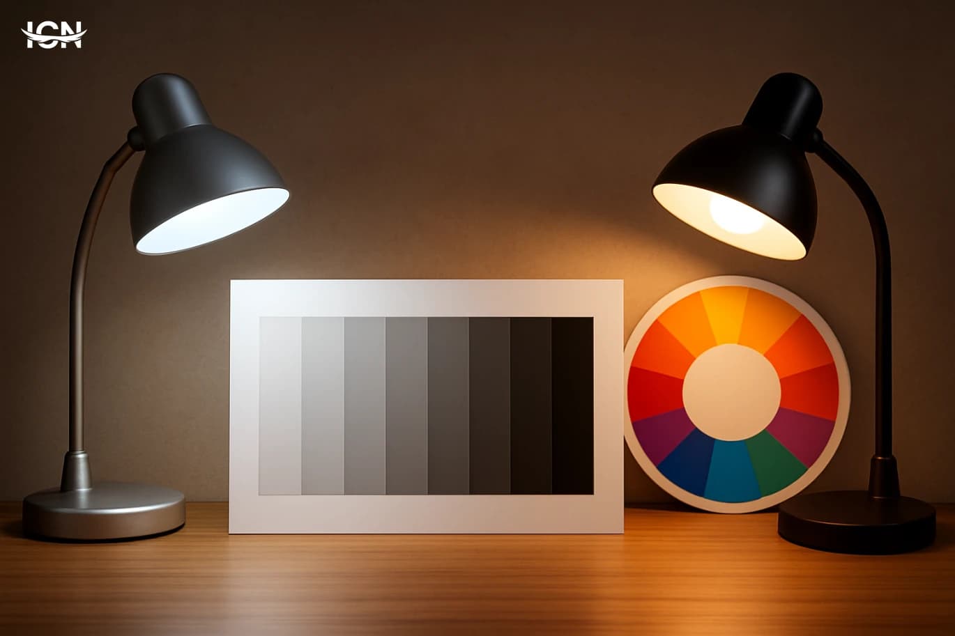
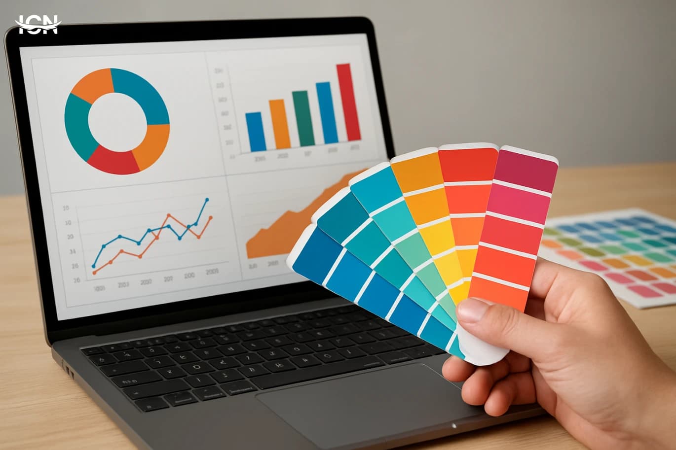
Many dashboards look polished yet communicate poorly because color is treated as decoration instead of a system. A common failure is using too many saturated hues at once, which makes every chart compete for attention and prevents the eye from finding what matters. Another is inconsistent meaning: red might indicate “bad” in one widget, then represent a product line in another, forcing users to relearn the legend repeatedly. Teams also overuse gradients and shadows that reduce contrast and make small labels harder to read. A practical way to diagnose problems is to review a dashboard in grayscale. If key information disappears, the design relies on color alone rather than structure, spacing, and contrast. Another quick check is to count distinct hues on the screen; beyond a small set, users struggle to remember what each color means. Effective color theory for dashboards is less about artistic taste and more about controlling attention, preserving readability, and assigning stable meaning across the entire interface.

Start with roles, not palettes

Before choosing any palette, define color roles. Most dashboards need a neutral base, an accent for highlights, and a limited set for categories. The neutral base includes background, gridlines, and secondary text; it should be quiet and high-contrast enough for long reading. The accent is reserved for the single most important state on the screen, such as the selected filter, the current period, or an outlier that needs attention. Category colors are used only when the user must compare groups, such as regions or product families. This role-first approach prevents a frequent mistake: assigning a different bright color to every chart element “because it looks better.” Instead, you decide what deserves emphasis and what should recede. A useful rule is to keep most of the interface in neutrals and spend saturation sparingly. When everything is loud, nothing is. When one element is clearly louder than the rest, the dashboard becomes faster to scan and easier to explain in meetings.

Contrast and readability under real conditions

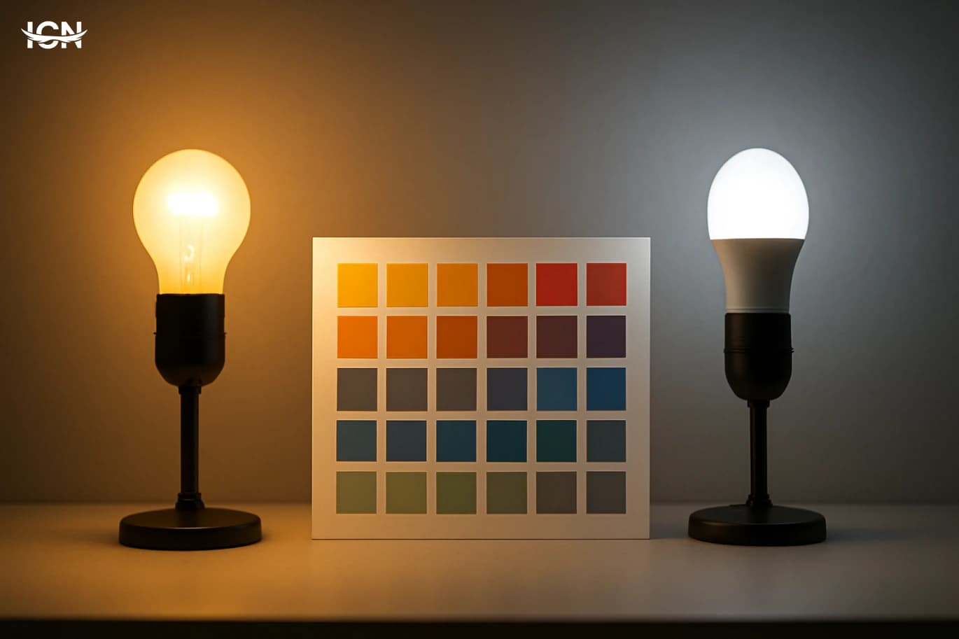
Dashboards are often viewed on laptops in bright offices, on projectors in meeting rooms, and on mobile screens during travel. Color choices that look fine on a designer’s monitor can fail in these environments. Prioritize luminance contrast between text and background, and avoid placing mid-tone text on mid-tone panels. Small labels, axis ticks, and tooltips need stronger contrast than large titles because thin strokes disappear first. Also consider how adjacent colors interact. Two different hues with similar brightness can blur together, especially in stacked bars or heatmaps. In those cases, vary lightness as well as hue so boundaries remain visible. When using a dark theme, don’t rely on pure black backgrounds; very dark grays reduce glare and make colored elements look less harsh. For light themes, avoid pure white panels everywhere; subtle off-whites help separate sections without adding more colors. A practical workflow is to test your key charts at 100% zoom and at a distance. If you cannot read the main numbers quickly, adjust contrast before changing the palette. Readability is the foundation; color theory supports it, not the other way around.

Category colors that stay consistent

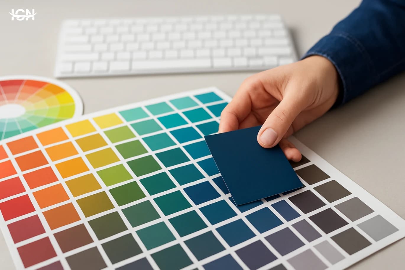
When dashboards compare categories, the biggest risk is inconsistency across pages and time. If “North Region” is blue today and green tomorrow, users lose trust and spend time reinterpreting charts. Establish a fixed mapping between categories and colors, document it, and apply it everywhere: charts, legends, filters, and even exported slides. Limit the number of category colors to what people can reliably distinguish. For many business dashboards, 6 to 8 distinct category colors is a practical ceiling; beyond that, patterns become hard to track and legends become cluttered. If you must show more categories, use grouping, sorting, or interactive filtering rather than adding more hues. Another technique is to use one family of colors with different lightness levels, but only if the chart type supports it and labels remain readable. Finally, avoid using your alert colors (often red or orange) as category colors. Alerts should be reserved for status or exceptions; mixing them with categories creates confusion and can cause users to misread normal values as problems.

Sequential and diverging scales for numbers

Not all numeric data should use the same color scale. For values that go from low to high with no meaningful midpoint, use a sequential scale: one hue that becomes lighter or darker as values increase. This works well for heatmaps, intensity maps, and ranked tables because the user can quickly see “more” versus “less” without decoding multiple colors. For metrics with a meaningful center point, such as variance from target, profit vs. loss, or change compared to last month, use a diverging scale. A diverging scale has two hues that move away from a neutral midpoint, making it easy to spot direction as well as magnitude. The midpoint should be visually calm, often a light gray or a very light tint, so that only meaningful deviations stand out. Be careful with rainbow scales. They can create false boundaries where none exist and make equal steps in data look unequal. If you need many steps, prefer a perceptually smoother scale where changes in lightness are consistent. In dashboards, clarity beats novelty: users should understand the scale in seconds, not admire it.

A simple checklist for teams

To make color decisions repeatable, teams benefit from a short checklist used in design reviews. First, confirm the roles: neutrals, one accent, and a limited category set. Second, verify contrast for text, small labels, and key numbers in both light and dark contexts if your product supports them. Third, check consistency: the same category must keep the same color across all pages and exports. Fourth, validate numeric scales: sequential for low-to-high, diverging for above/below a midpoint, and avoid rainbow scales unless there is a strong reason and clear labeling. Fifth, test for accessibility by ensuring information is not conveyed by color alone; use labels, icons, patterns, or direct annotations for critical states. Finally, run a “meeting room test”: view the dashboard on a projector or a shared screen and confirm that the main story is visible from a distance. This checklist turns color theory into an operational practice. The result is a dashboard that reads quickly, reduces misinterpretation, and supports decisions with less friction.


* All articles published on this blog are sourced from various websites and are provided for informational purposes only. They should not be considered as confirmed studies or accurate information. Please verify the information independently before relying on it.

Similar ARTICLES

How Colors Can Shift Your Mood
The idea that colors change mood is popular, but the evidence is more specific than many headlines suggest. Studies in environmental psychology and marketing repeatedly find that color can influence self-reported feelings, attention, and perceived comfort, yet the effect size is often moderate and strongly shaped by context. A bright, saturated color may feel energizing in a gym but overwhelming in a small bedroom. Researchers also distinguish between short-term mood shifts and longer-term well-being; color is more reliably linked to immediate impressions and arousal than to lasting emotional states. A useful way to understand the findings is to separate three layers: physiological arousal (how alert you feel), cognitive appraisal (what you think the color means), and learned associations (memories and cultural cues). Warm hues like reds and oranges are often associated with higher arousal, while many cool hues like blues are associated with calmness, but these are tendencies, not universal rules. Lighting, contrast, and surrounding materials can reverse the experience. A deep blue under cold LED lighting can feel sterile rather than soothing, while a muted terracotta in soft daylight can feel stable and comfortable. Another consistent result is that preference matters. People who like a color tend to report more positive feelings in spaces dominated by that color. That means any “one-size-fits-all palette” is risky. The most practical takeaway from research is not that a single color guarantees a specific mood, but that color choices can nudge attention and comfort when they match the purpose of a space and the user’s expectations.
Color Temperature Choices That Shape Perception
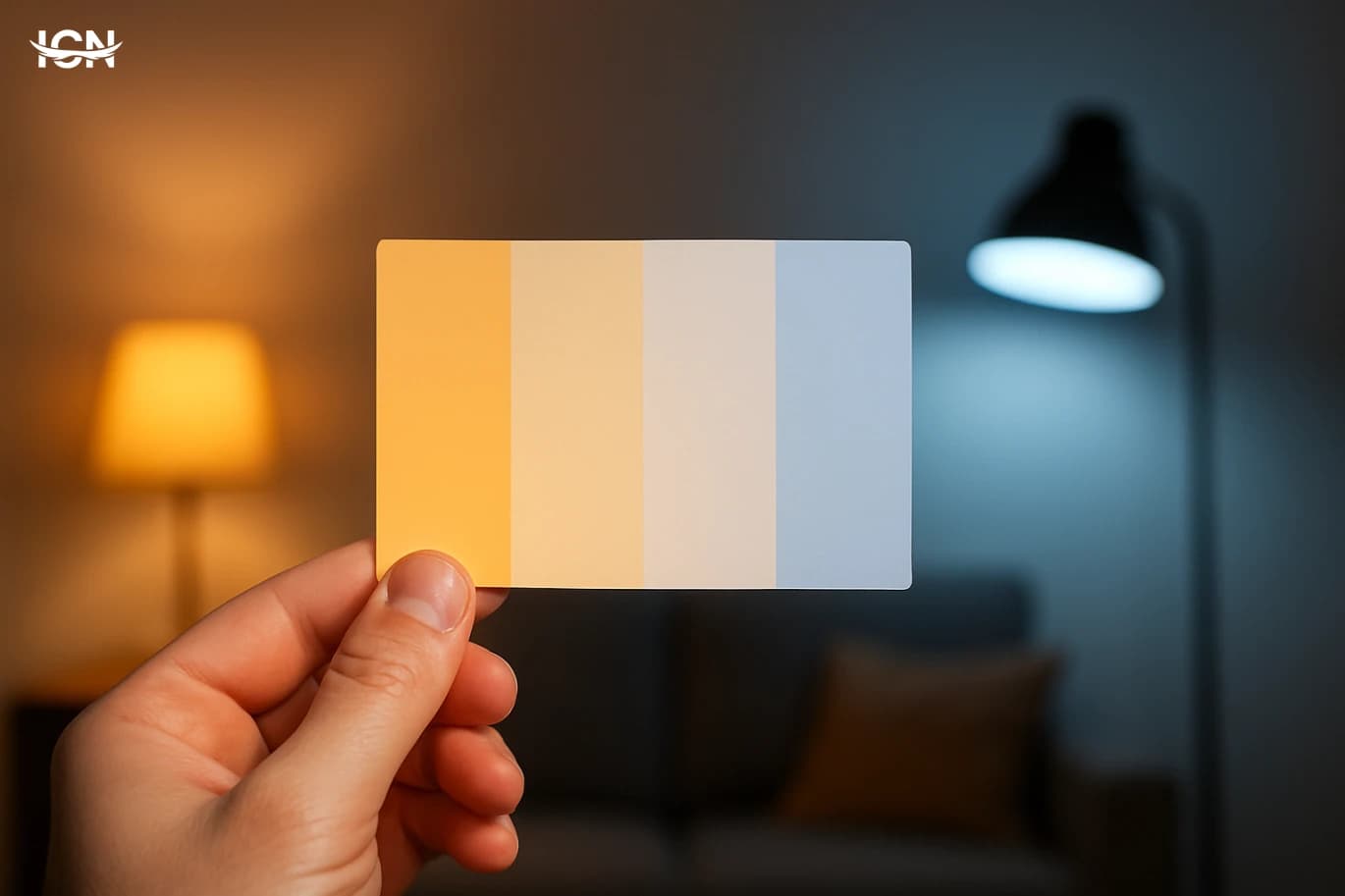
Color temperature is the practical language behind “warm” and “cool” palettes. It describes whether a color leans toward yellow, orange, and red (warm) or toward blue and blue-green (cool). In everyday design work, this single decision influences how people read a space, a product, or a screen: warm palettes can feel closer and more inviting, while cool palettes often feel cleaner and more distant. The effect is not abstract; it changes perceived size, brightness, and even how long a viewer stays focused. Temperature also affects contrast and legibility. A warm accent on a cool background can pop without needing extreme saturation, and a cool accent on a warm background can signal precision and calm. Because temperature is tied to lighting conditions, the same palette can look different under daylight, warm indoor bulbs, or a phone screen at night mode. Understanding temperature helps you predict these shifts and avoid surprises when a design moves from a mockup to the real world.
Color Temperature That Actually Works
Color temperature is often reduced to a simple split: warm colors feel friendly, cool colors feel calm. In real projects, that shortcut fails because temperature is relative and context-driven. A beige wall can read warm next to a blue sofa, but look neutral next to terracotta flooring. The same “warm” yellow can feel energetic in daylight and slightly muddy under warm indoor bulbs. Temperature is not a label you attach to a swatch; it is a relationship between colors, lighting, and surrounding materials. A practical way to think about temperature is to ask what the color is leaning toward. Reds can lean orange (warmer) or magenta (cooler). Blues can lean green (warmer) or violet (cooler). Even neutrals have undertones that push them warmer or cooler. When you treat temperature as a spectrum rather than a binary, you gain control over mood, clarity, and hierarchy. This matters in branding, interiors, packaging, and UI because temperature affects perceived cleanliness, freshness, comfort, and even how “expensive” a palette feels. Temperature also influences legibility and focus. Warm accents tend to advance visually, pulling attention forward, while cooler backgrounds often recede, creating depth. That is why many dashboards use cool grays and blues as a base and reserve warm colors for alerts or key actions. The goal is not to follow a rule, but to manage visual distance and priority. Understanding temperature as a tool for contrast, not just emotion, is the foundation for the rest of the decisions in a palette.
Color Temperature That Actually Works
Color temperature is often reduced to a simple split: warm equals reds and yellows, cool equals blues and greens. In practice, temperature is a relative judgment that changes depending on what sits next to a color, the lighting in the space, and the material carrying the pigment. A gray paint can read warm beside a blue sofa and cool beside a beige rug. That shift is not a trick; it is the core reason temperature is useful for planning palettes. Temperature also shapes perceived distance and emphasis. Warmer notes tend to feel closer and more prominent, while cooler notes can feel calmer and more recessed, especially in large fields like walls, backgrounds, or product surfaces. Designers use this to guide attention without adding more contrast than necessary. In branding, a slightly warmer neutral can make a logo feel more approachable; in interiors, a cooler white can make a room feel cleaner but also less forgiving under evening light. The key is to stop labeling colors in isolation and start describing them in context: warmer than what, cooler than what, and under which light. Once temperature becomes a comparative tool, it becomes easier to build consistent schemes across print, screens, and physical spaces.
Choosing Colors That Read Well Everywhere
Color choices that look perfect on a designer’s monitor often break down in everyday conditions. The same palette can feel crisp on a laptop, washed out on a budget phone, and harsh under office LEDs. This is not only about taste; it is about how color behaves across different screens, lighting, and materials. A bright yellow label that pops on white in a mockup may become hard to read when printed on slightly warm paper, or when viewed outdoors where glare reduces contrast. Legibility problems usually show up in predictable places: small text over gradients, thin icons on saturated backgrounds, and “soft” pastel combinations that rely on subtle differences. Another common failure is relying on hue differences alone, such as red text on green or blue on purple, which can blur for many viewers and on many displays. Even when the colors are technically different, the eye may not separate them well if their brightness is similar. A practical way to think about color legibility is to treat it as an engineering constraint, not a finishing touch. If a color system must work on a website, in an app, on printed packaging, and in social media images, it needs rules that survive compression, scaling, and imperfect viewing conditions. The goal is not to remove personality from design, but to ensure that personality remains readable and consistent wherever the color appears.
Color Temperature That Actually Works
Color temperature is one of the fastest ways to control how a design feels without changing any layout. Warm palettes (reds, oranges, warm neutrals) tend to read as closer, more energetic, and more personal, while cool palettes (blues, greens, cool grays) often read as calmer, more distant, and more technical. The key is that temperature is not only about individual colors; it is about the balance across an entire composition. A single warm accent on a cool background can become a focal point even if it is small. Likewise, a warm background with cool accents can make the accents feel sharper and more “clean.” Temperature also affects perceived brightness. A warm yellow can look brighter than a cool blue at the same numeric lightness, which matters for readability and hierarchy. In practical terms, temperature decisions influence where the eye goes first, how long it stays, and what it remembers. This is why temperature is central in branding, product UI, packaging, and editorial graphics: it shapes attention and trust before the viewer reads a word.
Color Temperature Choices That Shape Perception
Color temperature is one of the fastest ways to steer how people read an image, a room, a product photo, or a brand layout. Warm palettes built around reds, oranges, and yellow-leaning neutrals often feel closer and more immediate, while cool palettes with blues, blue-greens, and gray-leaning neutrals tend to feel calmer and more distant. This is not only a mood issue; it affects perceived cleanliness, freshness, comfort, and even how large or small a space appears. In practical color theory, temperature is also about relationships. A single hue can look warmer or cooler depending on what sits next to it. A neutral gray may appear bluish beside a warm beige, and slightly warm beside a saturated blue. That relative shift is why temperature decisions should be made in context, not on isolated swatches. Designers who treat temperature as a system variable—rather than a personal preference—usually get more consistent results across screens, print, and real-world lighting.
Choosing Brand Colors That Convert
Color is often treated as decoration, but in digital products and marketing it functions as a decision cue. Users scan pages quickly and rely on visual shortcuts to judge credibility, hierarchy, and what to do next. High-contrast elements are noticed first, warm hues can feel more urgent, and muted palettes can signal restraint or premium positioning depending on context. These effects are not magic; they come from learned associations, readability, and the way the eye prioritizes edges and contrast. In conversion-focused design, color works through three practical mechanisms: attention, comprehension, and confidence. Attention is driven by contrast and placement, not by “bright colors” alone. Comprehension comes from consistent meaning, such as using one accent color for primary actions and another for warnings. Confidence is influenced by whether the palette looks coherent and accessible across devices. When color is inconsistent or hard to read, users hesitate, and hesitation is the enemy of conversion.
By clicking the SUBSCRIBE button, you are agreeing to our Privacy & Cookie Policy If you want to unsubsribe the marketing email, please proceed to our privacy center.
© 2005-2026 ICN. All Rights Reserved.