



Color Temperature Choices That Shape Perception
- Why Color Temperature Matters
- Warm vs Cool in Real Environments
- How Temperature Changes Color Harmony
- Temperature in Branding and Product Photos
- Common Mistakes and How to Avoid Them
- A Practical Checklist for Better Choices
Why Color Temperature Matters
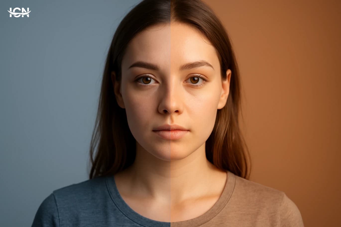
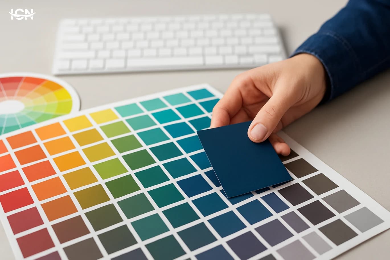
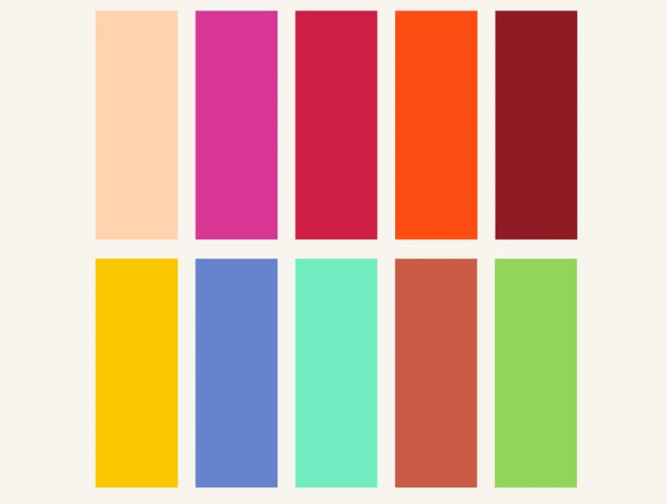
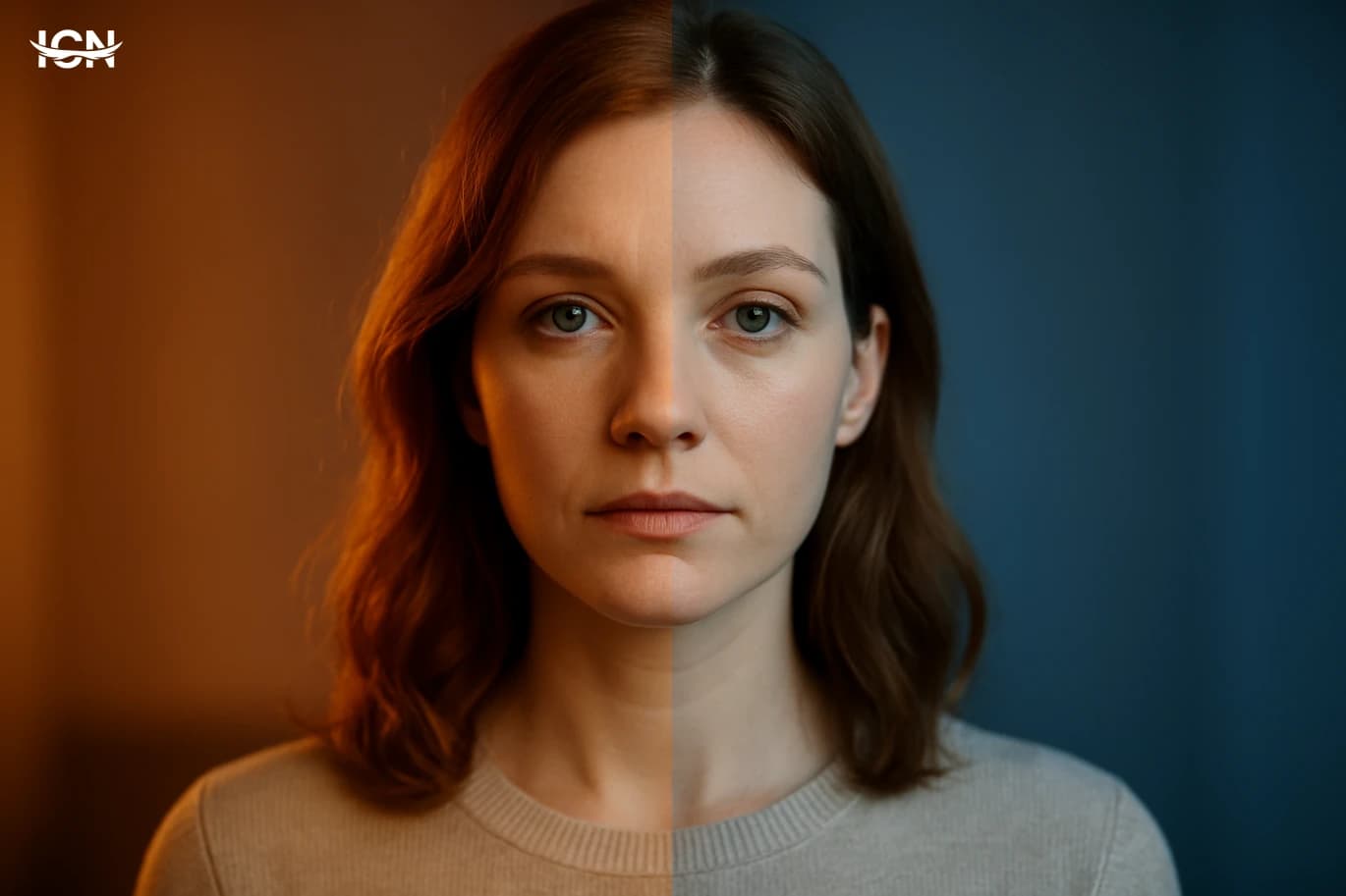
Color temperature is one of the fastest ways to steer how people read an image, a room, a product photo, or a brand layout. Warm palettes built around reds, oranges, and yellow-leaning neutrals often feel closer and more immediate, while cool palettes with blues, blue-greens, and gray-leaning neutrals tend to feel calmer and more distant. This is not only a mood issue; it affects perceived cleanliness, freshness, comfort, and even how large or small a space appears. In practical color theory, temperature is also about relationships. A single hue can look warmer or cooler depending on what sits next to it. A neutral gray may appear bluish beside a warm beige, and slightly warm beside a saturated blue. That relative shift is why temperature decisions should be made in context, not on isolated swatches. Designers who treat temperature as a system variable—rather than a personal preference—usually get more consistent results across screens, print, and real-world lighting.
Warm vs Cool in Real Environments
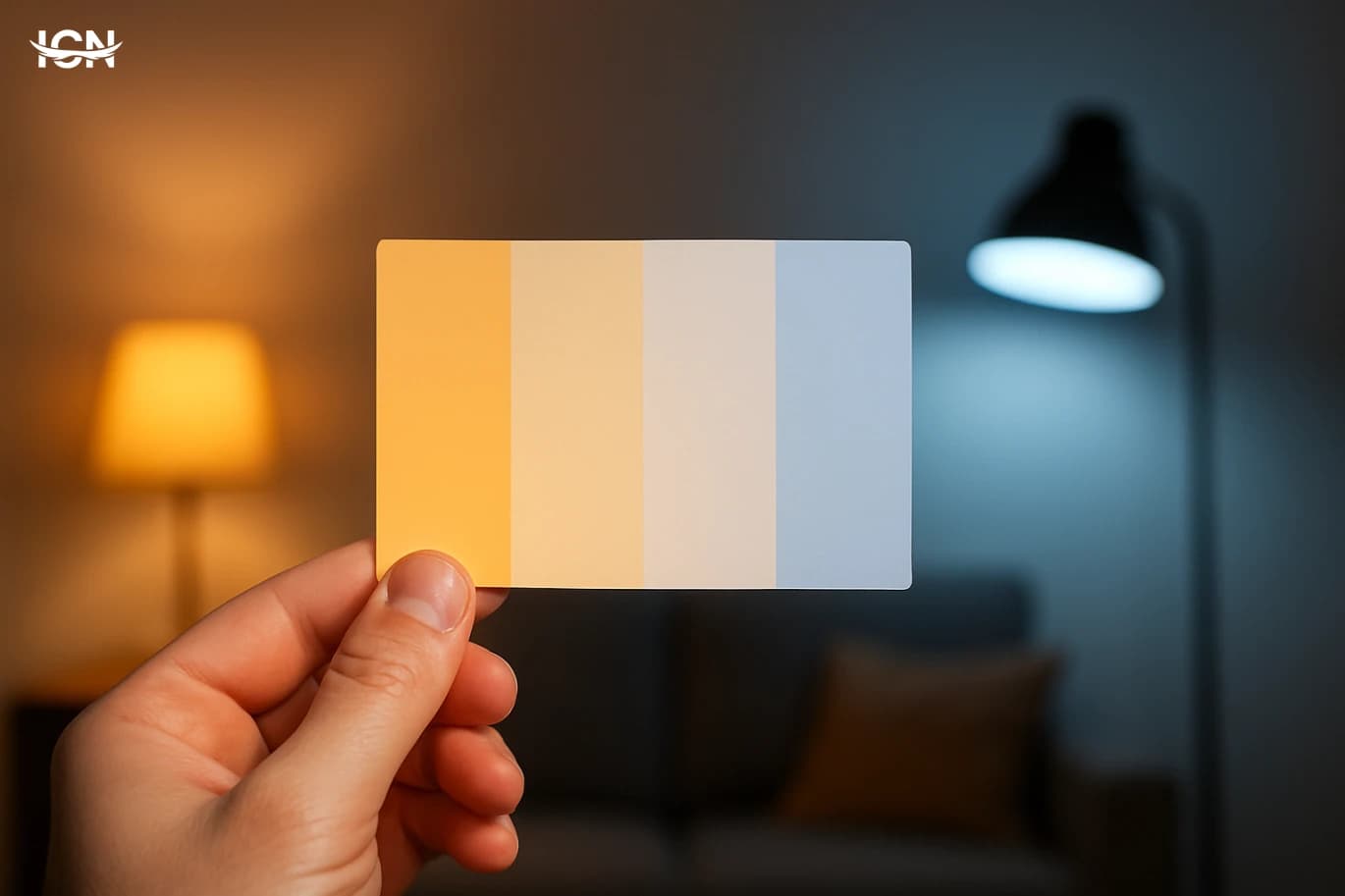
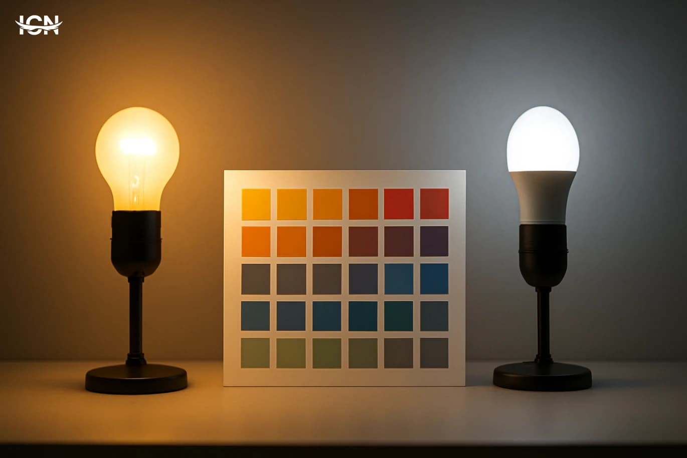
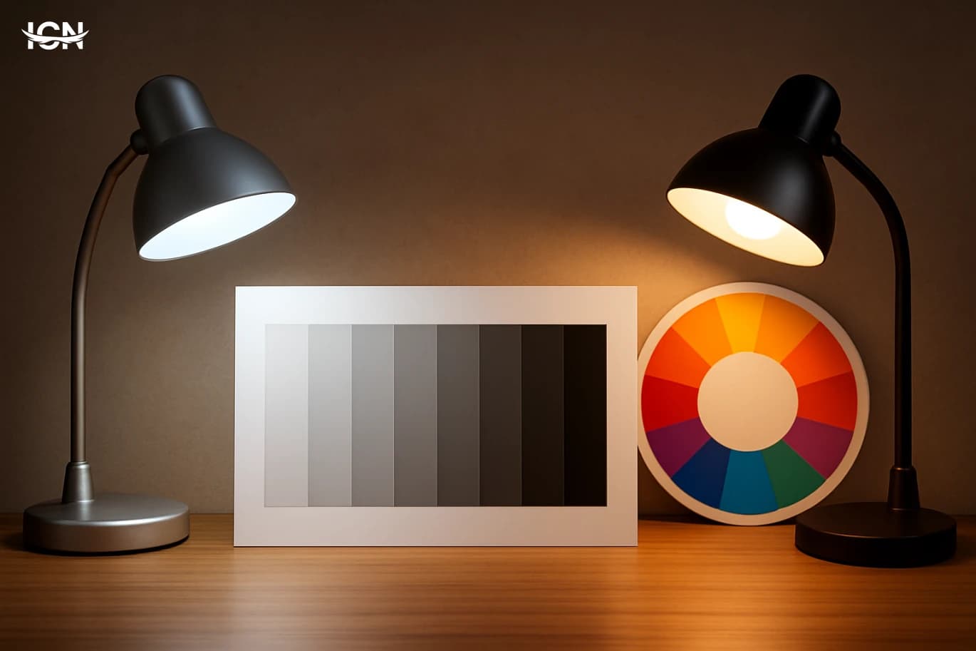
Temperature behaves differently in real environments than it does in a design file. Daylight shifts from cool in the morning to warmer near sunset, and indoor lighting can range from warm residential bulbs to cooler office LEDs. A palette that looks balanced on a calibrated monitor can feel flat or overly yellow under warm light, or harsh under cool light. That is why photographers and interior designers routinely test colors under multiple lighting conditions. Material surfaces also change the story. Matte paint absorbs light and can make warm colors feel heavier, while glossy finishes reflect highlights that can cool down the appearance. Wood, stone, and textiles introduce their own undertones, which can push a “neutral” wall into warm or cool territory. In retail and hospitality, temperature choices are often tied to dwell time and product perception: warm lighting and warm accents can make spaces feel inviting, while cooler schemes can signal efficiency, precision, and a modern, minimal atmosphere.
How Temperature Changes Color Harmony
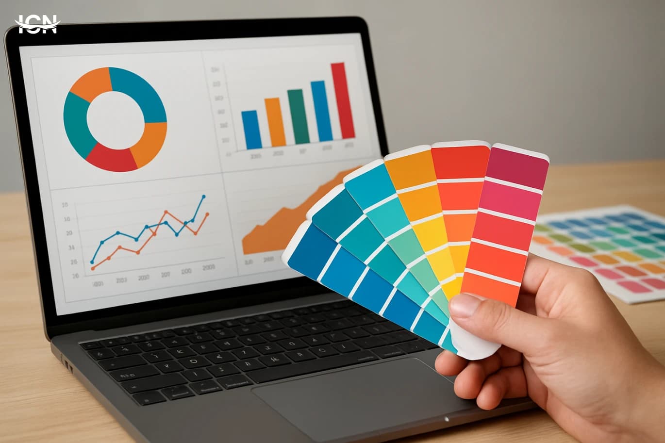
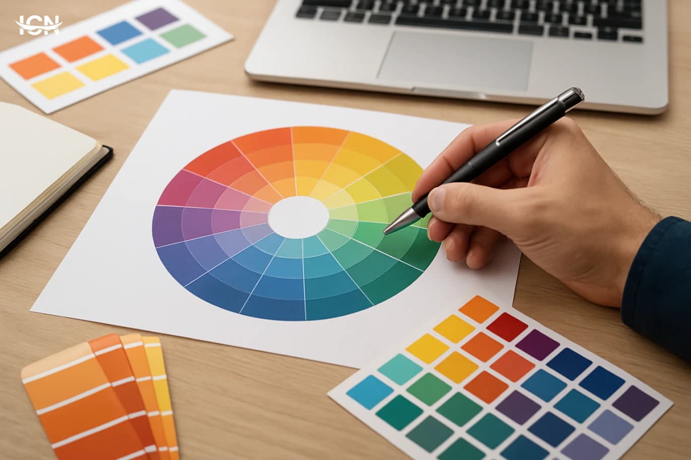
Many harmony schemes—complementary, analogous, triadic—look different once temperature is considered. A complementary pair like blue and orange can be tuned to feel energetic or refined depending on which side is warmed or cooled. A slightly muted, cool blue with a soft, warm orange can read as premium and controlled, while highly saturated versions can feel loud and promotional. Temperature also helps manage contrast without relying only on brightness. Two colors can share similar lightness but still separate clearly if one is warm and the other is cool. This is useful in interface design where excessive contrast can feel aggressive, yet insufficient separation hurts usability. In print and packaging, temperature can guide the eye through hierarchy: warm accents pull attention to calls to action, while cooler fields can hold background information without competing. The key is consistency: if the primary palette is cool, a warm accent becomes powerful, but too many warm notes can erase the intended structure.
Temperature in Branding and Product Photos
Brands often use temperature to signal category and positioning. Food and beverage visuals frequently lean warm to emphasize freshness, ripeness, and comfort, while technology and healthcare brands often lean cool to suggest clarity and reliability. However, the most effective approach is not copying category norms but choosing a temperature strategy that matches the brand promise and the viewing context. Product photography is especially sensitive. A warm white balance can make baked goods and wood textures look appealing, but it can also distort the perceived color of cosmetics, clothing, or paint samples. Cool balance can make metals and glass look crisp, but it can make skin tones and natural materials look lifeless. For e-commerce, consistency across a catalog matters as much as the “best” look for a single image. Many teams establish a temperature target, then use controlled lighting and color references so that a customer sees predictable results across multiple products and devices.
Common Mistakes and How to Avoid Them
A frequent mistake is mixing warm and cool neutrals without a plan. A warm off-white paired with a cool gray can look dirty or mismatched if the undertones clash. Another issue is relying on a single viewing condition: approving colors under office lighting and then discovering they shift dramatically in daylight or in a customer’s home. Overusing warm accents is also common; if everything is warm, nothing stands out, and the design loses hierarchy. To avoid these problems, start by defining a temperature “home base” for the project: mostly warm, mostly cool, or deliberately balanced. Then choose neutrals that share compatible undertones. Test palettes in context: on the intended background, next to real imagery, and under the lighting conditions where the work will live. For digital products, check at least two display types and include a quick grayscale check to confirm that structure does not depend only on temperature. Finally, document the choices so future assets stay consistent rather than drifting warmer or cooler over time.
A Practical Checklist for Better Choices
A reliable workflow makes temperature decisions easier and repeatable. First, define the goal in measurable terms: increase perceived warmth and comfort, improve clarity and cleanliness, or create a premium, restrained feel. Second, pick a dominant temperature and reserve the opposite temperature for controlled accents. Third, lock neutrals early, because they influence every other color; decide whether whites and grays should lean warm, cool, or neutral. Next, test with real content. If the project includes people, products, or interiors, drop representative images into the layout and check whether skin tones, materials, and backgrounds remain believable. For print, request a proof or at least compare swatches under different lights. For digital, view on multiple devices and in both bright and dim environments. Finally, write down the rules: target temperature range, approved neutrals, and where warm or cool accents are allowed. This turns temperature from a subjective debate into a controlled design parameter that supports consistent perception.