



Color Temperature That Actually Works
- Why temperature matters beyond “warm vs cool”
- Reading undertones in neutrals and “almost grays”
- Balancing warm and cool for depth and clarity
- Temperature in digital products and accessibility
- A repeatable workflow for choosing temperature
Why temperature matters beyond “warm vs cool”
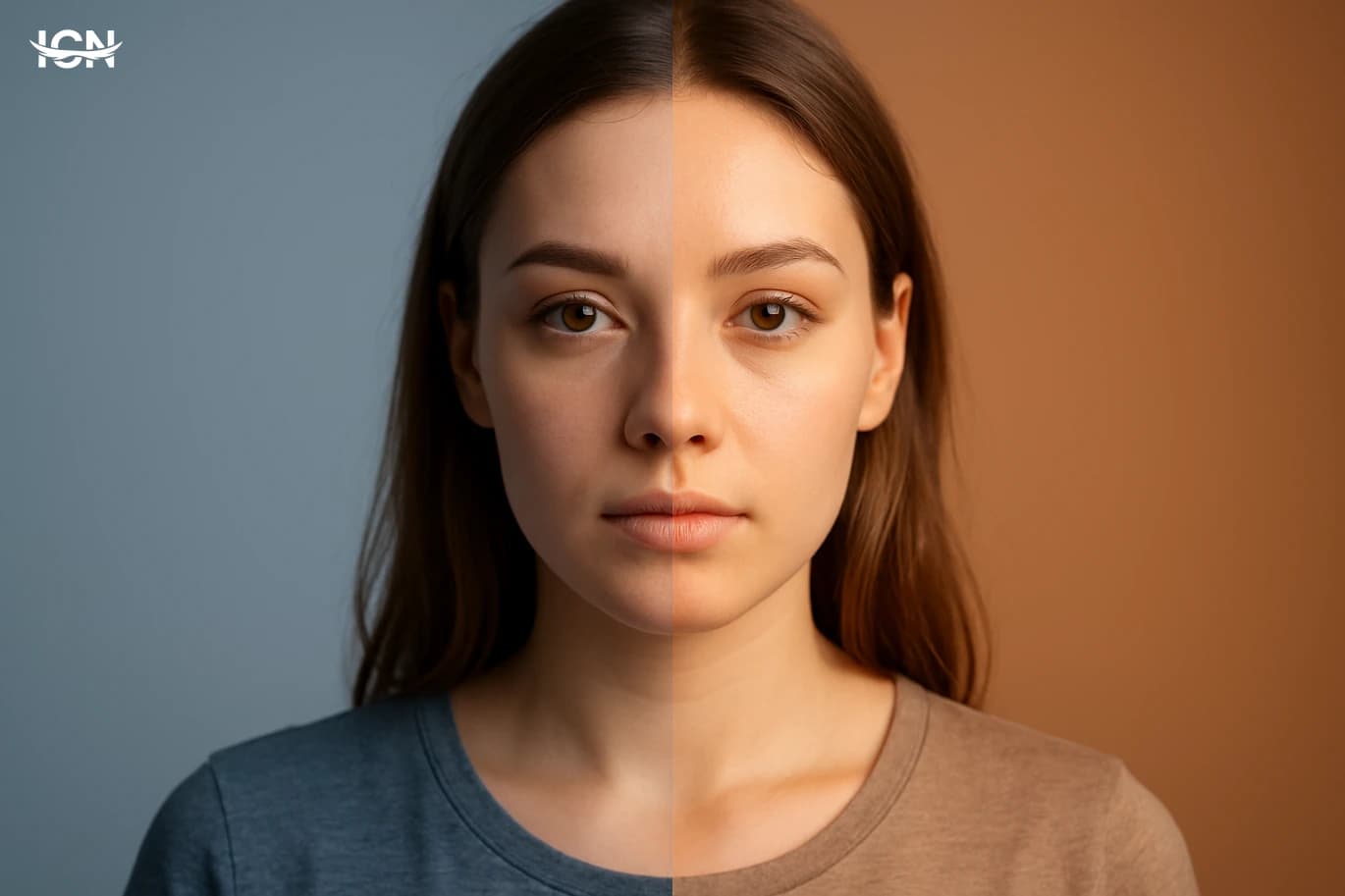
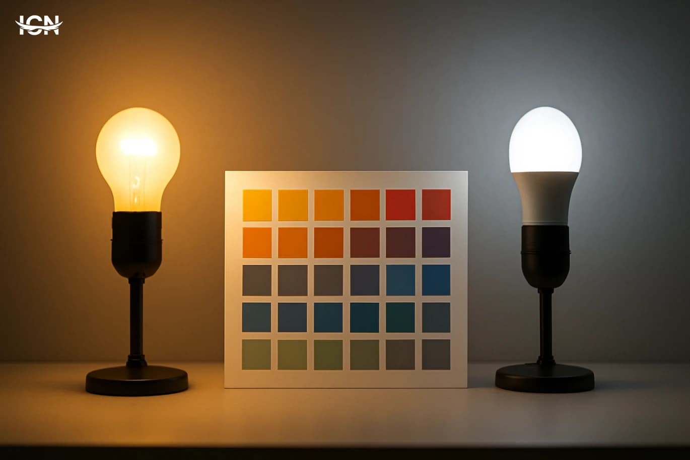
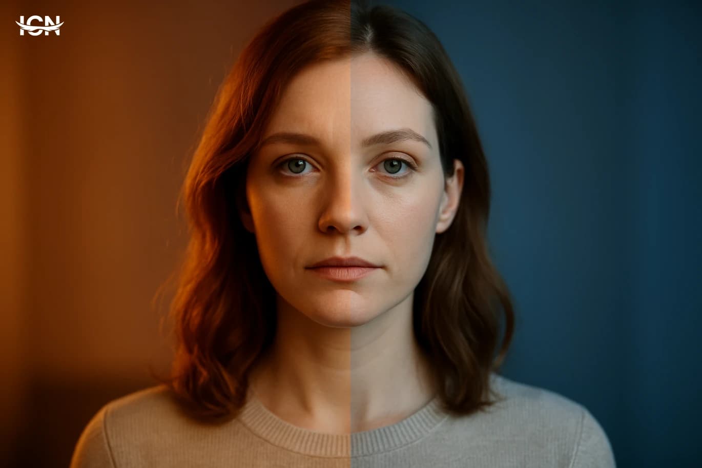
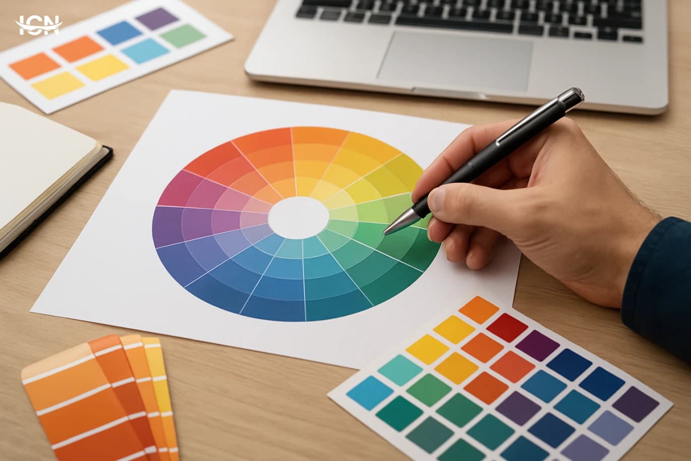
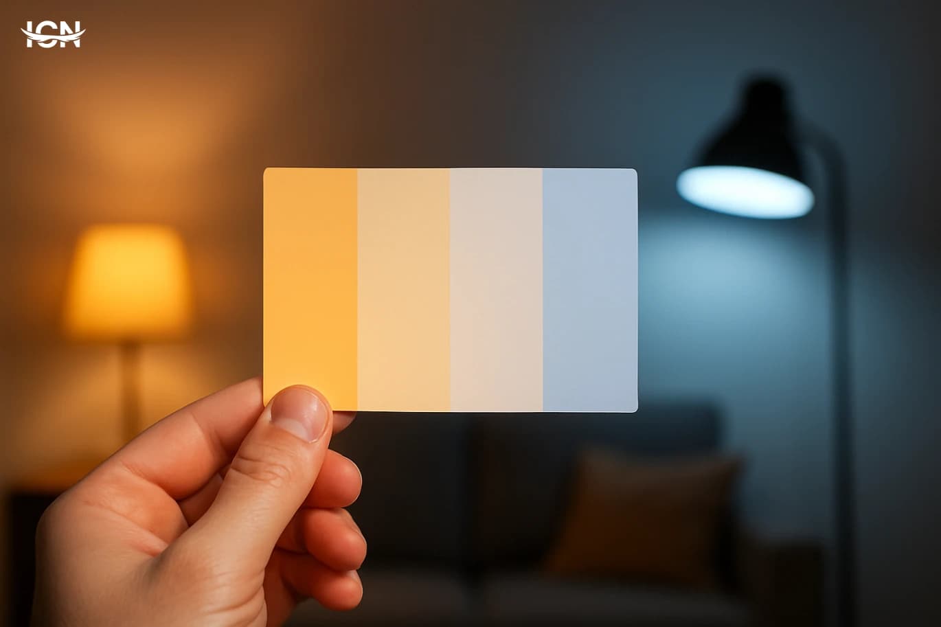
Color temperature is often reduced to a simple split: warm colors feel friendly, cool colors feel calm. In real projects, that shortcut fails because temperature is relative and context-driven. A beige wall can read warm next to a blue sofa, but look neutral next to terracotta flooring. The same “warm” yellow can feel energetic in daylight and slightly muddy under warm indoor bulbs. Temperature is not a label you attach to a swatch; it is a relationship between colors, lighting, and surrounding materials. A practical way to think about temperature is to ask what the color is leaning toward. Reds can lean orange (warmer) or magenta (cooler). Blues can lean green (warmer) or violet (cooler). Even neutrals have undertones that push them warmer or cooler. When you treat temperature as a spectrum rather than a binary, you gain control over mood, clarity, and hierarchy. This matters in branding, interiors, packaging, and UI because temperature affects perceived cleanliness, freshness, comfort, and even how “expensive” a palette feels. Temperature also influences legibility and focus. Warm accents tend to advance visually, pulling attention forward, while cooler backgrounds often recede, creating depth. That is why many dashboards use cool grays and blues as a base and reserve warm colors for alerts or key actions. The goal is not to follow a rule, but to manage visual distance and priority. Understanding temperature as a tool for contrast, not just emotion, is the foundation for the rest of the decisions in a palette.
Reading undertones in neutrals and “almost grays”
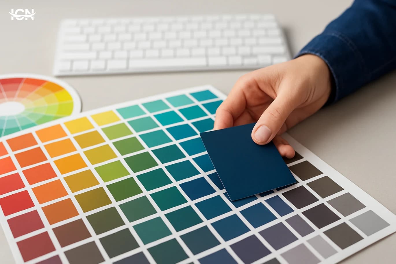
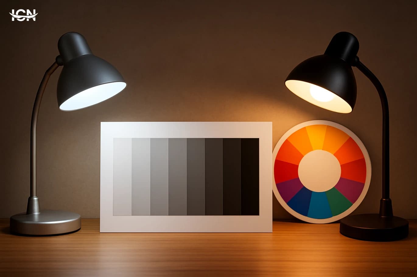
Neutrals are where most palettes succeed or fail. Designers may spend hours choosing a hero color, then default to “a gray” for backgrounds and typography. But grays are rarely neutral in practice. Many carry a blue, green, violet, or brown undertone that becomes obvious only when placed next to other colors. This is why a gray that looks clean on a white screen can suddenly feel cold and clinical next to warm wood, or why an off-white paint can look pinkish when paired with a cool marble. To read undertones, compare neutrals in groups, not one at a time. Place three to five candidates side by side and look for which one shifts toward blue (cool), green (cool-warm depending on context), or red/yellow (warm). Then test them against the key materials or brand colors they will live with. In digital work, test on both light and dark modes and across common display settings, because a slightly bluish gray can become harsh on high-contrast screens. A useful technique is to anchor your neutral set with a “reference white” and a “reference black” that match the project’s temperature. A warm palette benefits from an off-white with a subtle yellow or red undertone and a near-black that is slightly brown or deep olive rather than pure charcoal. A cool palette often works better with a crisp white that leans blue and a near-black that leans navy or deep purple. These choices reduce the chance that your neutrals will fight your accents. The payoff is consistency: photos, icons, and text feel like they belong to the same system instead of sitting on top of it.
Balancing warm and cool for depth and clarity
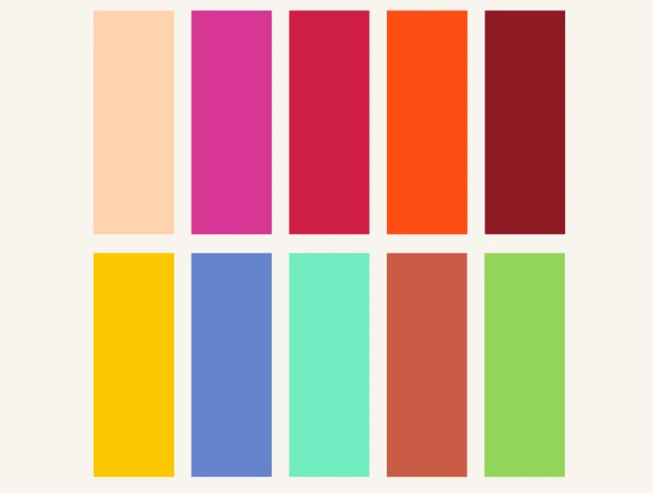
A palette that is entirely warm can feel heavy, while an all-cool palette can feel distant. The most reliable approach is controlled mixing: choose a dominant temperature and then add a smaller counter-temperature to create depth. In interiors, a warm room (creams, woods, terracotta) often benefits from a cool counterpoint like slate, muted teal, or a blue-gray textile. In branding, a cool primary (navy, teal) can gain approachability with a warm accent such as coral or amber. The key is proportion. A common working ratio is 70/20/10: 70% dominant temperature in backgrounds and large surfaces, 20% supporting temperature in secondary elements, and 10% accent for emphasis. This is not a strict formula, but it prevents the palette from becoming noisy. If warm and cool are equal in weight, the design can feel unsettled because the eye cannot decide what is foreground and what is atmosphere. Also consider saturation. A small amount of a highly saturated warm color can overpower a large area of cool neutrals. If you need a calm interface, keep warm accents slightly muted and reserve high saturation for rare, meaningful moments like a primary call-to-action. For print and packaging, test under different lighting: warm store lighting can push warm inks further, while daylight can make cool colors look cleaner and more contrasty. Balancing temperature is not only about picking colors; it is about managing how those colors behave at scale, in context, and over time.
Temperature in digital products and accessibility
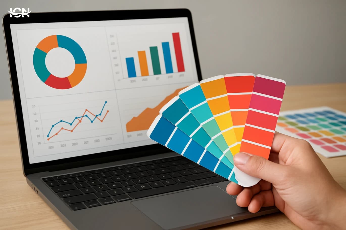
In digital design, temperature choices affect usability as much as style. Cool backgrounds (blue-grays, charcoal with a blue cast) often feel crisp and help white text appear cleaner, but they can also increase perceived contrast and eye fatigue if pushed too far. Warm backgrounds (beige, warm gray) can feel comfortable for reading, yet they may reduce the perceived sharpness of cool-colored icons and links. The best approach is to set temperature deliberately for each layer: background, surfaces, text, and interactive states. Accessibility adds another constraint: contrast ratios and color differentiation must hold regardless of temperature. A warm accent like orange can look bright but still fail contrast on a light warm background. Similarly, a cool blue link can become hard to distinguish from surrounding text if the page uses cool grays with low chroma. Solve this by testing contrast early and by using more than color to signal state: underline links, add icons, use weight changes, and ensure focus outlines are visible. Temperature also interacts with semantic color systems. Many products use red for errors and green for success, but both colors can shift in perceived temperature depending on their undertones. A green that leans yellow reads warmer and can feel “warning-like” next to a warm UI, while a green that leans blue reads cooler and can feel more technical. Define your semantic colors with temperature in mind and document them with examples: how they look on light and dark surfaces, in disabled states, and in charts. This documentation prevents teams from introducing random warm or cool variants that slowly erode consistency.
A repeatable workflow for choosing temperature
To make temperature decisions repeatable, start with context and constraints. First, define the environment: is the palette for a screen, a printed package, or a physical space? Note the dominant lighting (daylight, warm indoor, mixed). Second, choose a dominant temperature based on the brand or purpose: a healthcare app may prefer cool clarity, while a café menu may benefit from warm appetite cues. Third, build a neutral ladder (background to text) that matches that temperature, then add one counter-temperature accent for depth. Next, test with real content. Drop in photos, charts, and typical text lengths. A palette that looks balanced in abstract swatches can fail when a product photo introduces a strong warm highlight or when a chart adds multiple hues. Adjust undertones before adjusting hue: often the fix is shifting a gray slightly warmer or cooler rather than changing the main brand color. Finally, document the temperature logic. Write down which colors are “warm-leaning” and “cool-leaning,” where they are allowed, and what they should not be paired with. Include do-and-don’t examples and specify proportions for common layouts. This turns temperature from a subjective debate into an operational system. Teams can then extend the palette—adding seasonal campaigns or new UI components—without drifting into mismatched warms and cools that confuse users and weaken recognition.