



Color Temperature That Actually Works
- Why Color Temperature Changes Everything
- Warm vs Cool Is Not a Binary Choice
- How Lighting and Screens Shift Temperature
- Building a Temperature-Driven Palette Step by Step
- Common Mistakes and Practical Fixes
- A Quick Temperature Checklist
Why Color Temperature Changes Everything
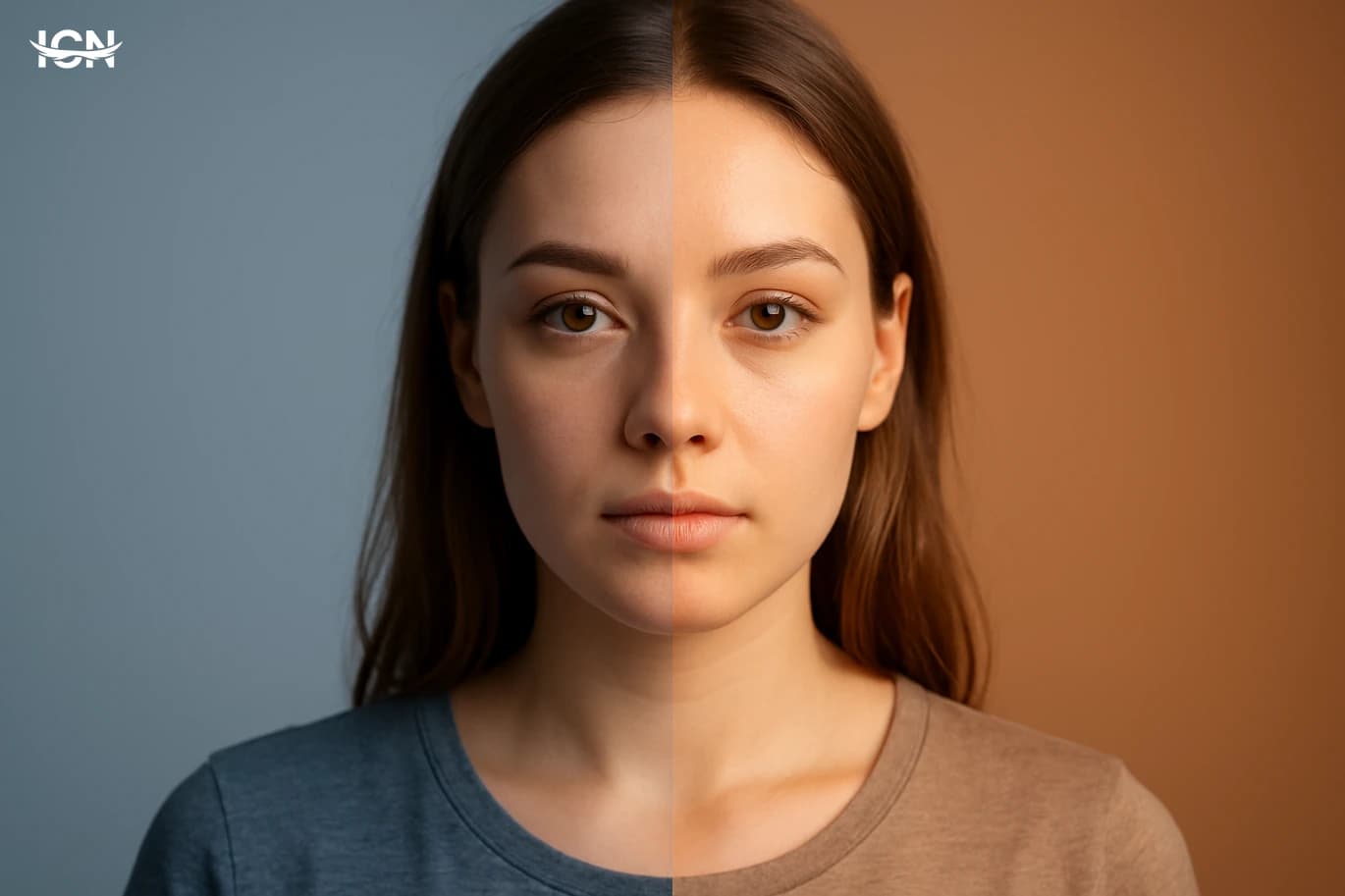
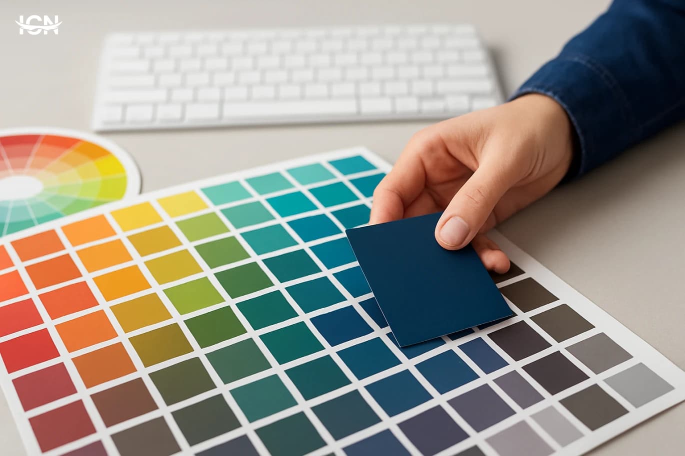
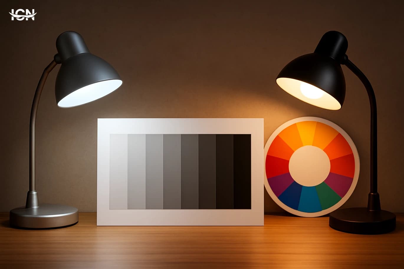
Color temperature is one of the fastest ways to control how a design feels without changing any layout. Warm palettes (reds, oranges, warm neutrals) tend to read as closer, more energetic, and more personal, while cool palettes (blues, greens, cool grays) often read as calmer, more distant, and more technical. The key is that temperature is not only about individual colors; it is about the balance across an entire composition. A single warm accent on a cool background can become a focal point even if it is small. Likewise, a warm background with cool accents can make the accents feel sharper and more “clean.” Temperature also affects perceived brightness. A warm yellow can look brighter than a cool blue at the same numeric lightness, which matters for readability and hierarchy. In practical terms, temperature decisions influence where the eye goes first, how long it stays, and what it remembers. This is why temperature is central in branding, product UI, packaging, and editorial graphics: it shapes attention and trust before the viewer reads a word.
Warm vs Cool Is Not a Binary Choice
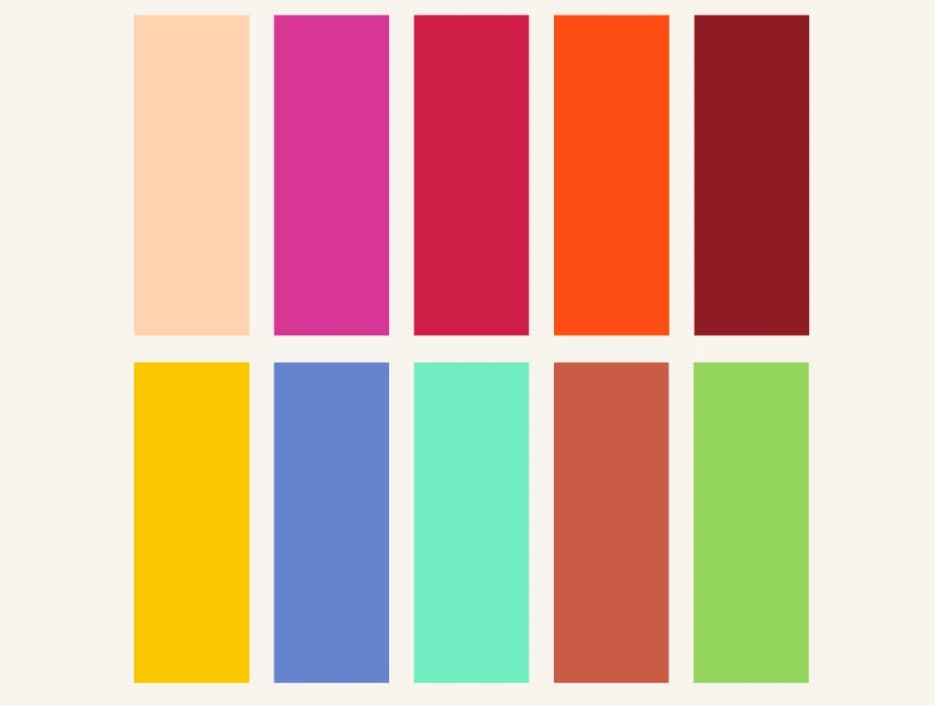
Many designers treat temperature as a switch: either a warm brand or a cool brand. In reality, most effective palettes are mixed, but with a clear “home base.” A palette can be primarily cool, for example, and still include warm skin tones in photography, warm highlights in charts, or a warm call-to-action button. The question is not whether you mix temperatures, but how you control the ratio and the placement. A useful approach is to define three roles: a dominant temperature (the background and large surfaces), a supporting temperature (secondary UI elements, panels, or illustrations), and an accent temperature (small, high-contrast elements that must be noticed). When these roles are consistent, the design feels intentional even if it uses many colors. When roles are unclear, the palette can feel noisy, and users may struggle to identify what matters. This is also where neutrals matter. “Neutral” is not always neutral: a gray can lean blue (cool) or brown (warm). Choosing warm neutrals can soften a cool palette without adding obvious warm colors, and choosing cool neutrals can make a warm palette feel more modern and less heavy.
How Lighting and Screens Shift Temperature
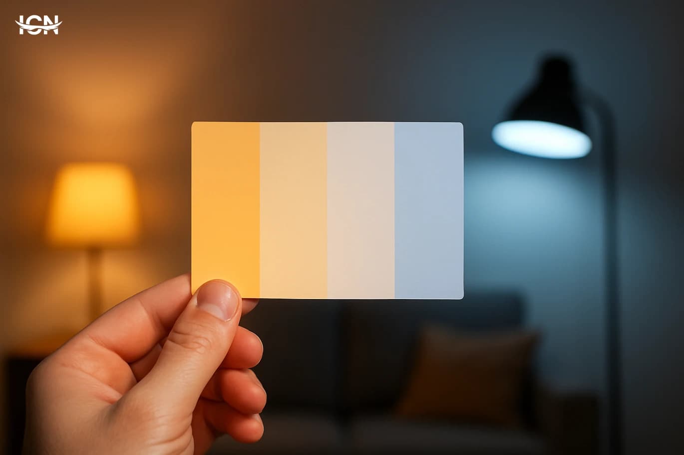
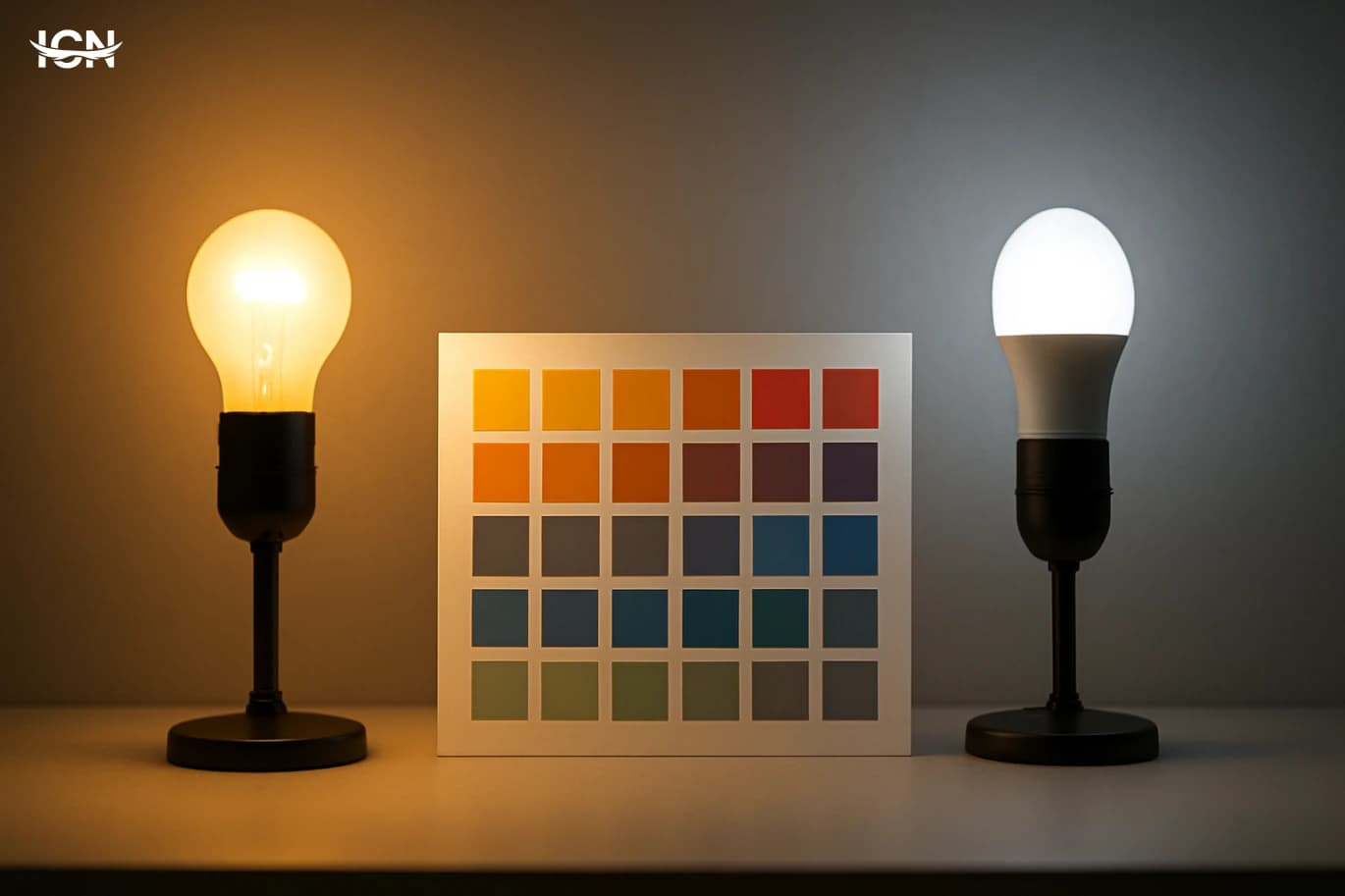
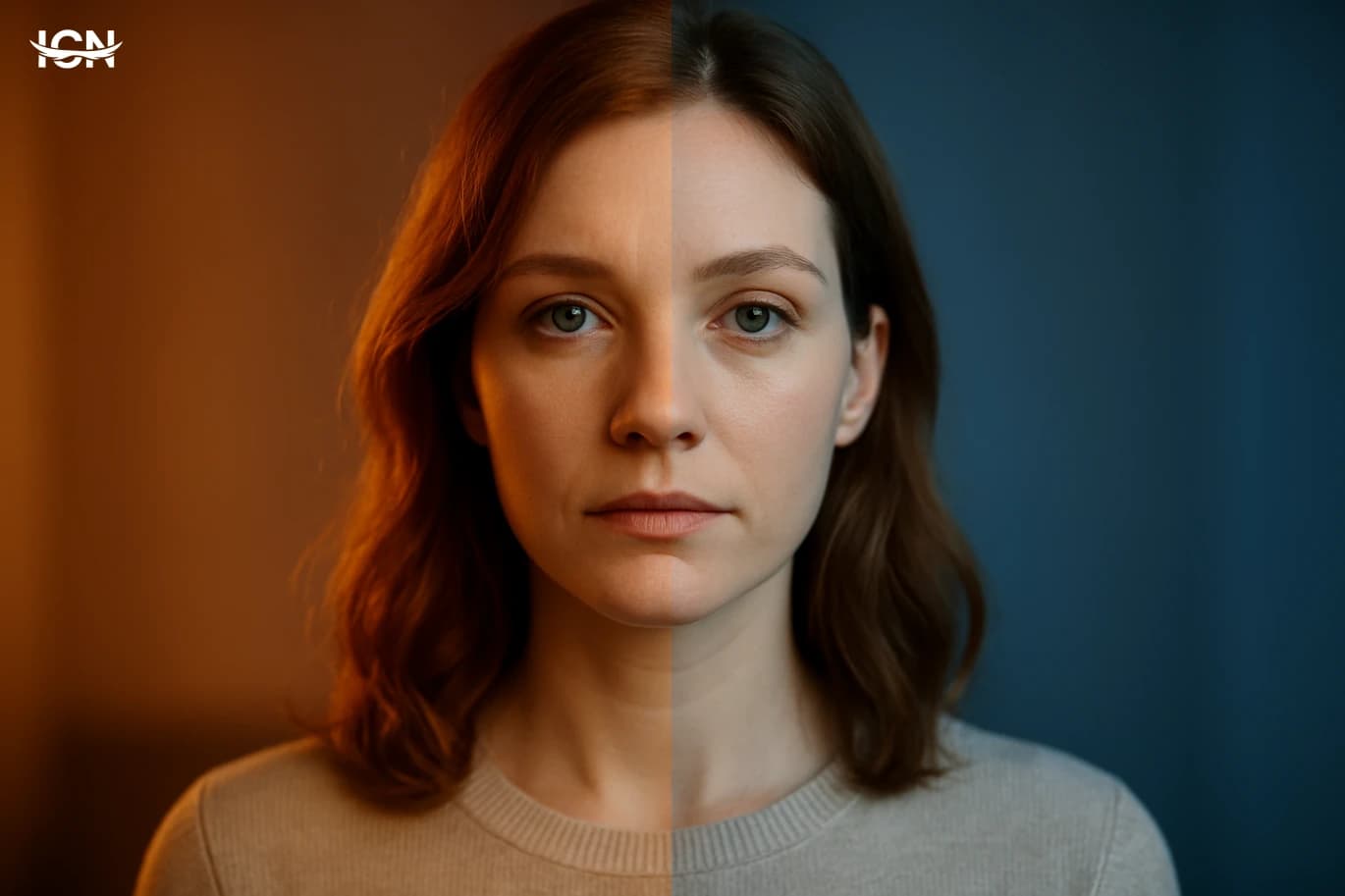
Color temperature is not experienced in a vacuum. The same palette can look different under daylight, warm indoor lighting, or on screens with different calibration. A cool gray background may appear slightly green on one monitor and slightly blue on another. Warm creams can turn muddy under warm lighting, and blues can become harsh on high-contrast displays. To reduce surprises, test palettes in at least three contexts: a bright environment (daylight), a warm indoor environment, and a dim environment. If the design is for digital products, check it on both a high-end phone screen and a typical laptop. If it is for print, view proofs under standardized lighting when possible, and also under the lighting where the product will be seen, such as retail store lighting. Another practical factor is white point. Many devices and apps offer “night mode” or warmer display settings. If your interface relies on subtle cool-vs-warm differences to convey state, those differences may collapse when the screen shifts warmer. In those cases, reinforce meaning with value contrast, shape, labels, or patterns rather than temperature alone.
Building a Temperature-Driven Palette Step by Step
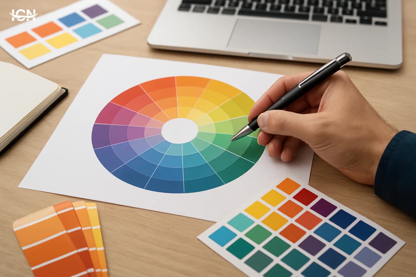
Start by choosing a dominant temperature that matches the product context. Financial dashboards and productivity tools often benefit from cooler bases because they support long viewing sessions and reduce the feeling of visual pressure. Food, hospitality, and lifestyle brands often use warmer bases to feel welcoming. This is not a rule, but it is a practical starting point. Next, pick two neutrals: one for backgrounds and one for text and strokes. Decide whether those neutrals lean warm or cool, and keep that decision consistent. Then select one supporting hue on the opposite side of the temperature spectrum to create controlled contrast. For example, a cool base can use a warm amber for highlights, while a warm base can use a cool teal for secondary elements. Finally, define an accent color with a clear job: calls to action, alerts, or key data points. Keep the accent usage limited and measurable, such as “no more than 5% of the screen.” This prevents the accent from becoming background noise. When you test, look for three outcomes: the accent is instantly visible, the supporting hue does not compete with it, and the dominant temperature remains the overall impression. If you work with multiple brand colors, assign each one a temperature role rather than letting them all compete. This turns a large palette into a system.
Common Mistakes and Practical Fixes
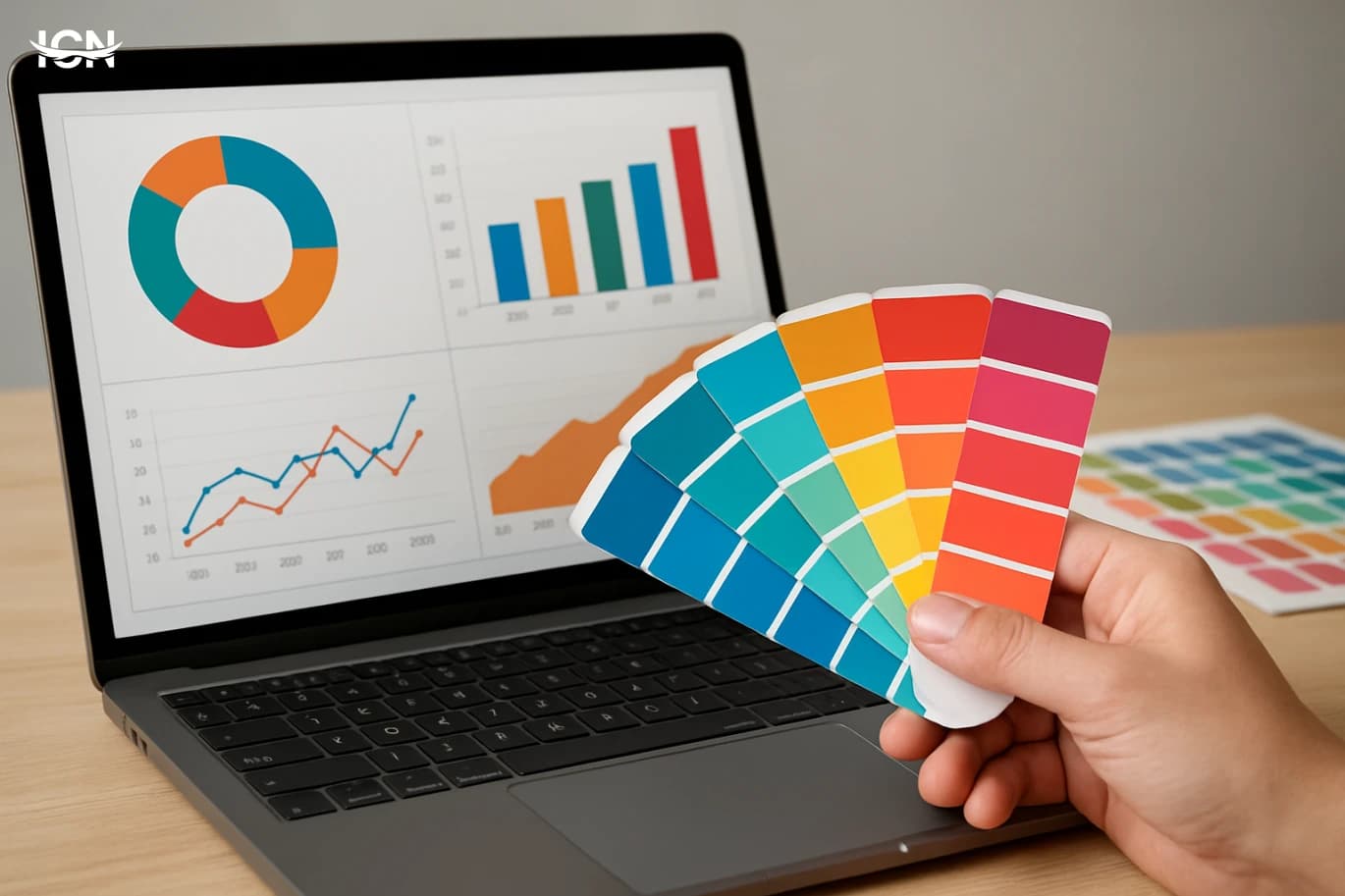
A frequent mistake is mixing warm and cool neutrals without noticing. A warm beige background with a cool gray card can look like a mismatch, even if both are “neutral.” Fix this by sampling neutrals from the same temperature family, or by intentionally separating them with a clear border or shadow that explains the layer change. Another issue is using temperature to signal meaning without enough contrast. For example, using a slightly warmer gray to indicate “active” and a slightly cooler gray for “inactive” may fail for many users and devices. Fix it by increasing value contrast, adding an underline, changing icon weight, or using a clear accent color. Overusing warm accents is also common. Warm colors advance visually, so too many warm elements can make the interface feel crowded. Fix it by reserving warm accents for the most important actions and moving secondary highlights to cooler tones or to neutral treatments. Finally, watch photography and illustration. A cool UI with warm photos can work, but only if you control the image treatment. Consistent white balance, a light color grade, or a subtle overlay can keep images from breaking the temperature system.
A Quick Temperature Checklist
Before publishing a design system or a campaign, run a simple checklist. First, identify the dominant temperature in one sentence, such as “cool base with warm accents.” If you cannot describe it clearly, the palette may be drifting. Second, verify that neutrals share the same lean, especially backgrounds, cards, and dividers. Third, confirm that the accent color has a single primary job and limited coverage. Next, test in different environments and with accessibility in mind. Check that key states do not rely only on temperature differences, and that text contrast remains strong when the screen shifts warmer or cooler. Finally, review real content: charts, photos, and user-generated images. Temperature control is only proven when the system holds up with the messy variety of actual materials. If the checklist passes, you will have a palette that feels consistent, communicates hierarchy, and stays reliable across devices and lighting conditions.