
App Logo

Download Our App

Shop your way

logologo
Image

Print design

10/22/2025By: ICN
Print design

Introduction to print design

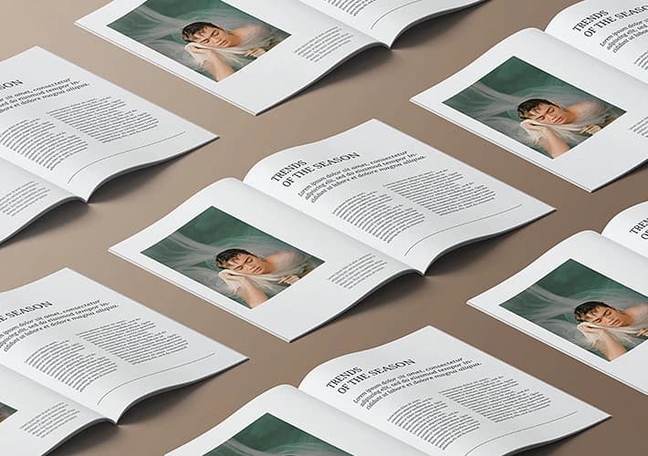
A. The concept of print design and its importance is the art of prints design and the science of creating printed materials that transmit messages and information effectively and attractive. This design includes brochures, work cards, magazines, and stickers, and is an essential part of the visual identity of any brand. Print design helps attract attention and enhance brand awareness. for. The date of the development of publications design began to design publications in ancient times, with the appearance of writing on stone panels and paper. With the passage of time, the method and method of printing evolved, allowing artists and designers innovation and expressing their ideas in a new and inspiring way. In the modern era, the design became more interactive thanks to digital technology.

The basic principles of print design

A. Balance and consistency of balance is an essential component in the design of publications, as it ensures the distribution of elements evenly on the page, which makes it easier for the reader to interact with the content. Consistency in the design of shapes and pattern enhances the attractiveness of publications and reflects the brand's professionalism. for. Using colors and lines effectively colors play a vital role in provoking feelings and creating a specific atmosphere. Colors should be chosen carefully to reflect the brand identity. As for the lines, it reflects the style of the publication and affects the clarity of the message, so it is necessary to choose lines that are appropriate to the content and the target audience.

Print design elements

A. Pictures and illustrations pictures and illustrations are vital elements in the design of publications, as they help to transfer the message faster and interact with the audience. Using high -quality images that support the effectiveness of the printed and encourage attention, which contributes to enhancing the visual identity of the brand. for. The texts and literal prints texts are important to transfer information clearly and accurately. Craft prints should be consistent with printed design, making it easier to read and make the message clear. Choosing the right words and the way to display contributes to enhancing the general experience of the reader and reflects a professional image of the brand.

Print design tools and techniques

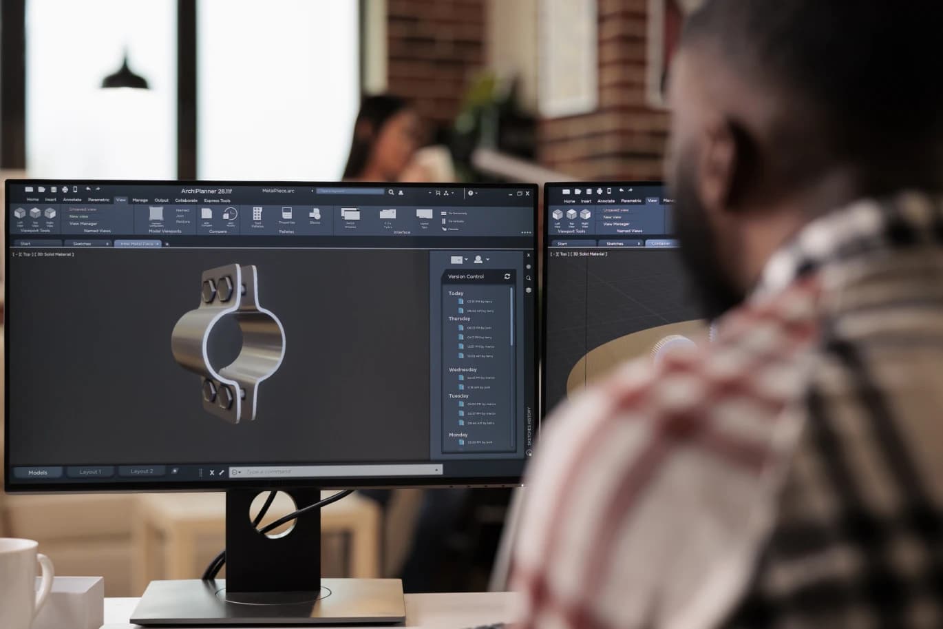
A. Modern design programs modern design programs are an essential element in the process of designing publications. These programs allow designers to create innovative and easy to modify designs. With tools like Adobe InDesign and Illustrator, designers can quickly and carefully achieve their ideas. for. Traditional tools and methods of work traditional tools, such as colors and pens, still occupy a special place in the design world. These tools are used in the initial planning stages, helping designers draw their ideas before moving to digital media. The adoption of organizational work methods ensures the production of elaborate and professional work, which enhances the quality of publications.

Choose colors and lines strategies

A. The color science of color science plays a pivotal role in the design of publications, as it can affect the feelings of the recipient. It is important to choose the colors that reflect the brand's identity and suit the message to be connected. for. Choosing suitable lines for the goal and the public. Choose the lines is a vital part of the design process, as the lines must reflect the brand's personality and be suitable for the target audience. The clear and print lines facilitate the communication process and ensure the professional design, while the lines are used to add a unique touch.
* All articles published on this blog are sourced from various websites and are provided for informational purposes only. They should not be considered as confirmed studies or accurate information. Please verify the information independently before relying on it.

Similar ARTICLES

Designing Storefronts That Convert Foot Traffic
A storefront is not a single display window; it is a compact design system that combines architecture, signage, lighting, merchandising, and wayfinding into one decision point. In many retail streets, a passerby gives a store only a few seconds before deciding to enter or keep walking. That means the storefront must communicate category, price positioning, and trust cues instantly. Good design reduces uncertainty: people should understand what you sell, who it is for, and how to start shopping without hesitation. Treat the storefront like a funnel. The outer layer captures attention with contrast and legibility; the middle layer clarifies the offer with product cues and pricing signals; the inner layer guides movement through the threshold. When these layers are inconsistent—luxury typography with bargain-bin clutter, or premium materials with confusing messaging—conversion drops. A coherent system aligns the brand’s promise with what the street actually sees, and it does so with measurable choices: type size, luminance, viewing angles, and the number of messages competing for attention.
Designing Clear Wayfinding for Public Spaces
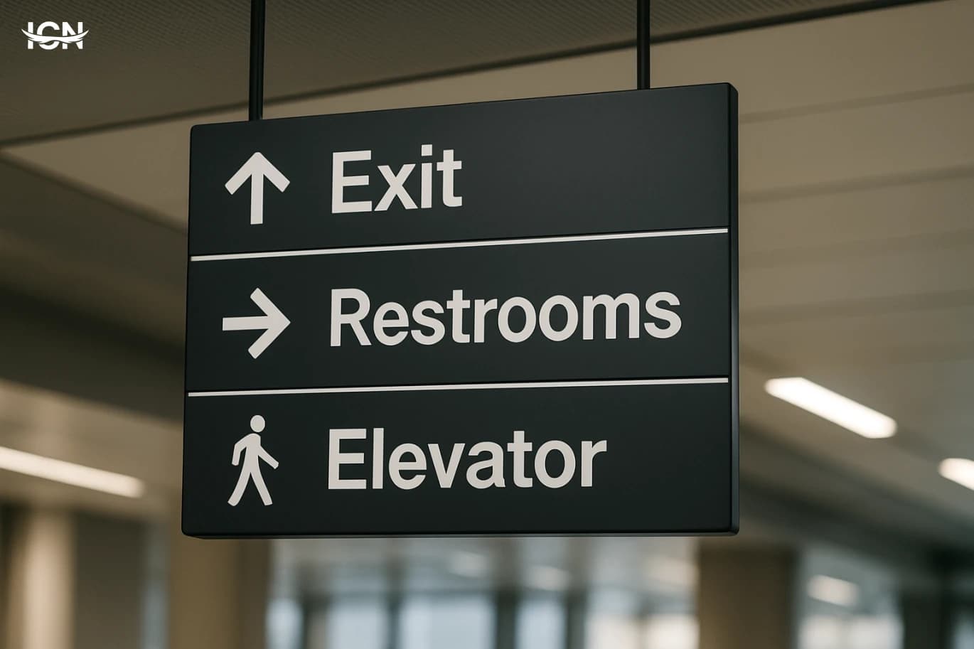
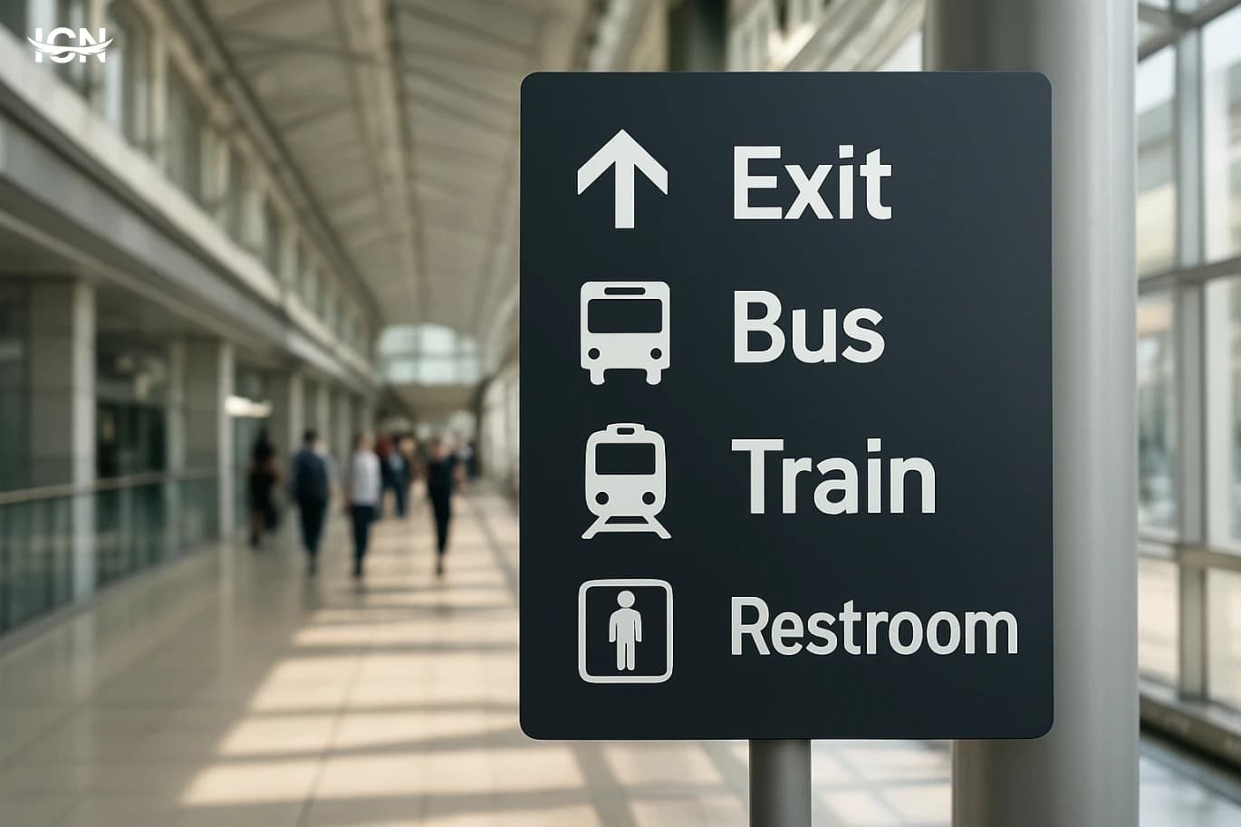
Wayfinding is often treated as a set of signs, but users experience it as a continuous journey: arriving, orienting, deciding, moving, and confirming. Failures usually happen when the environment forces people to make decisions before they have enough information. Common examples include hospital lobbies with multiple corridors and no clear “start here” point, transit stations where platform numbers are visible only after a turn, and large campuses where building names differ from what people see on maps. Another frequent issue is inconsistency: a destination is called “Customer Service” on one sign, “Help Desk” on another, and “Information” on a third. Design teams also underestimate stress and time pressure. In airports, clinics, and government service centers, users are often carrying bags, managing children, or worried about being late. Under these conditions, people scan for simple cues: arrows, color blocks, and familiar words. If the system relies on long sentences, small type, or too many options at once, users slow down and create bottlenecks. A practical way to diagnose failure is to watch where people stop, turn around, or ask staff for directions; those moments reveal missing decision points and unclear confirmation cues.
Designing Wayfinding That People Actually Follow
Wayfinding is often treated as a signage problem, but most failures start earlier: unclear destinations, inconsistent naming, and layouts that force last‑second decisions. In hospitals, campuses, airports, and large offices, people do not read every sign; they scan for confirmation while moving. If the environment does not provide predictable cues, users default to asking staff, following crowds, or backtracking, which increases congestion and stress. Common breakdowns are measurable. Signs placed after a decision point create “missed turns.” Too many messages on one panel slow scanning and reduce comprehension. Inconsistent terms—“Radiology” on one sign and “Imaging” on another—make users doubt they are on the right path. Poor contrast, glare, and small type reduce legibility at typical walking distances. Even perfect graphics cannot compensate for a route that requires repeated choices without clear landmarks. A practical way to frame the problem is to map the user’s journey into moments: arrival, orientation, route selection, confirmation, and destination. Each moment needs a specific design response. Arrival needs a clear entry cue and a simple overview. Orientation needs a “you are here” reference that matches what people see around them. Route selection needs a single, confident instruction. Confirmation needs frequent reassurance without visual clutter. Destination needs a clear endpoint marker that is visible before the user reaches the door.
Designing Retail Spaces That Convert
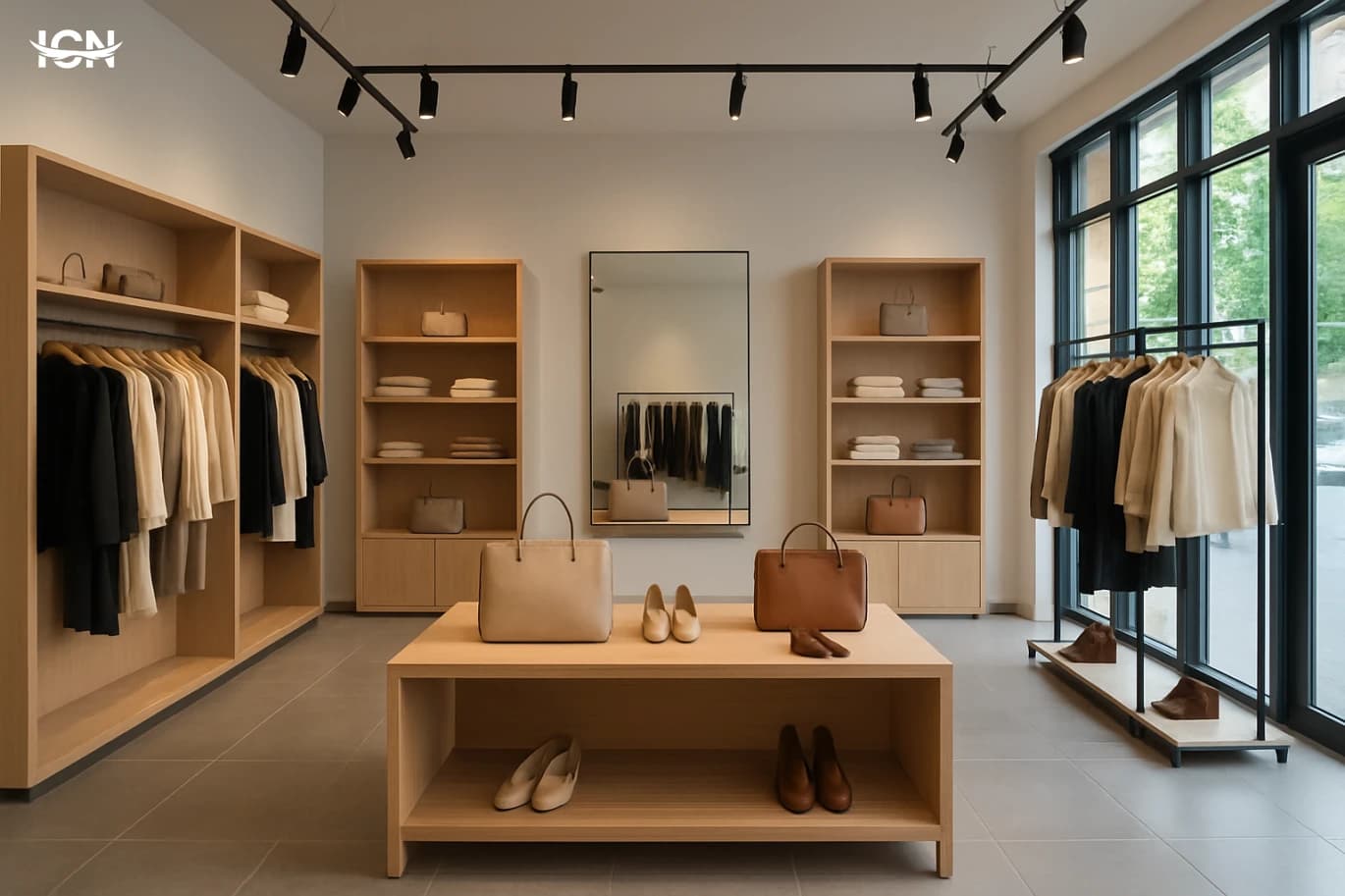
Retail design is not decoration; it is a system that guides attention, reduces friction, and increases confidence at the moment of purchase. A well-designed store makes it easy for shoppers to understand what you sell, where to go next, and how to compare options without feeling lost. This directly affects conversion rate, average basket size, and the likelihood of repeat visits. The most effective retail spaces are built around measurable behaviors: where people pause, which displays they touch, how long they wait, and what makes them abandon a purchase. Design decisions such as aisle width, product height, lighting temperature, and signage hierarchy can be tested and improved like any other business process. When design is treated as an operational asset, it supports staff efficiency, reduces returns, and strengthens brand recognition across locations.
Designing Retail Spaces That Convert
Retail design is often treated as decoration, but in high-performing stores it functions like a silent sales system. Layout, lighting, signage, and fixture choices shape how quickly shoppers understand the offer, how long they stay, and what they touch. A well-designed space reduces decision fatigue by making categories obvious and by guiding people through a clear sequence of discovery, comparison, and checkout. It also supports staff efficiency: when products are easy to find and replenishment routes are practical, service improves and queues shrink. The most useful way to evaluate a store is to connect design decisions to measurable outcomes. Track conversion rate, average transaction value, dwell time, and the percentage of visitors who reach key zones such as new arrivals or high-margin categories. When a redesign is planned, define what “better” means in numbers before choosing materials or furniture. This keeps the project focused on performance rather than trends, and it helps justify investments like improved lighting or a reworked checkout area.
Designing Clear Wayfinding for Public Spaces
Wayfinding design is the system of signs, maps, landmarks, and spatial cues that helps people move through a place with confidence. In airports, hospitals, university campuses, museums, and transit hubs, a visitor’s first impression is often shaped by whether they can find the right entrance, service desk, elevator, or platform without stress. When wayfinding is unclear, the cost shows up quickly: longer queues at information counters, missed appointments, late arrivals, and staff time spent giving directions. It also affects accessibility, because people with low vision, mobility limitations, or limited language proficiency rely heavily on consistent cues. Good wayfinding is not only about adding more signs. It is about designing a coherent experience from the moment someone approaches the building to the moment they reach a destination and return. That includes naming conventions, visual hierarchy, placement strategy, and the relationship between digital tools and physical space. A strong system reduces cognitive load, supports safety and comfort, and improves the perceived quality of the entire environment, even when the architecture is complex.
Designing Retail Packaging That Sells
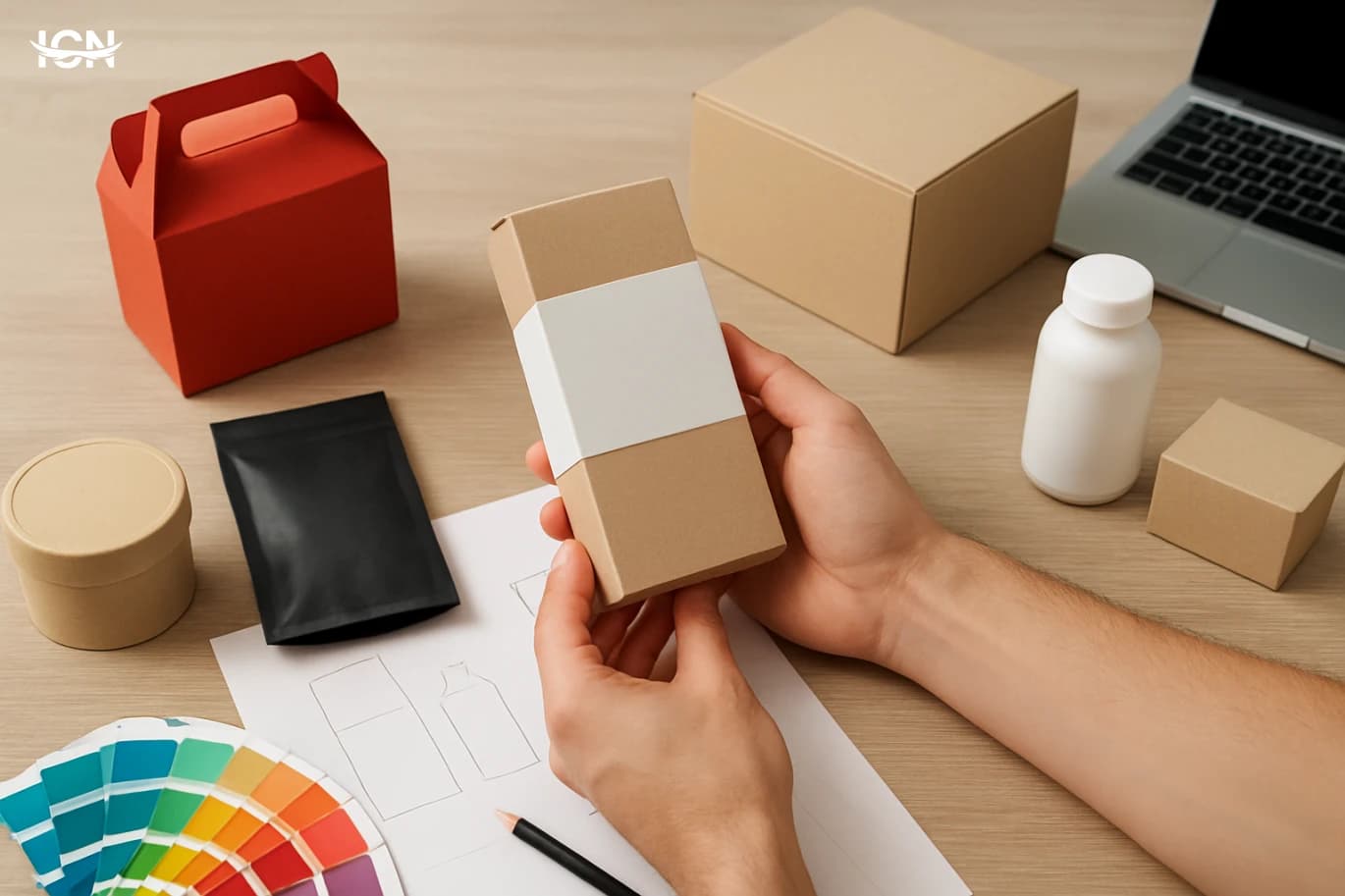
Retail packaging is often the only “salesperson” present at the shelf. In a few seconds, it must communicate what the product is, who it is for, and why it is worth choosing over alternatives. Good packaging design does this through clear hierarchy, recognizable cues, and a consistent brand system. It also reduces decision friction: shoppers should not need to rotate the box repeatedly to find basic information like size, flavor, compatibility, or key benefits. A practical way to evaluate packaging as a sales tool is to separate what it must achieve into three outcomes: stop, understand, and trust. “Stop” is shelf impact—contrast, shape, and color that stand out in a crowded planogram. “Understand” is fast comprehension—legible typography, simple claims, and visual signals that match the category. “Trust” is credibility—materials, finishing, and information design that feel honest and premium enough for the price point. When these outcomes align, packaging supports conversion without relying on heavy promotions.
By clicking the SUBSCRIBE button, you are agreeing to our Privacy & Cookie Policy If you want to unsubsribe the marketing email, please proceed to our privacy center.
© 2005-2026 ICN. All Rights Reserved.