
App Logo

Download Our App

Shop your way

logologo
Image

Optical tricks

07/24/2025By: ICN
Optical tricks

introduction

The concept of visual tricks involve visual tricks to create perceptions that appear differently from reality. These tricks are used to dazzle and challenge how we look at things. There is a variety of techniques and methods used, from photography and visual arts to 3D art. This concept shows how our awareness can be formed through visual elements and interact with them. The history of optical tricks dates back to ancient times, as artists used them to create amazing visual effects. Throughout the ages, these tricks have evolved into an essential part of the arts and design, reflecting human creativity and the desire to explore the limits of perception. Visual tricks highlight how optics affect the formation of human experiences.

Types of optical tricks

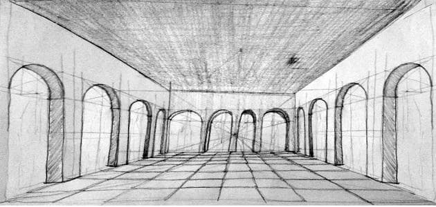
Sight tricks that use visual impressions these tricks are characterized by visual effects that play colors and shapes, which creates unexpected impressions. Among the famous examples of this is the effect of the street that looks inclined or widespread while it is actually flat. Sight tricks that depend on the manipulation of the mind, these tricks are confused by confusion by manipulating visual information, which causes the viewer to see something not in reality. Among the famous examples of this is the visual illusion "animated images", where the images appear as if they were moving when they are fixed.

How to make visual tricks

Using photography and manipulating with pictures, visual tricks are very popular because of how they use the image and photography. This is done through special techniques such as modifying images and adding certain effects that make the viewer make a visual error. The brilliant image can give a totally different impression on reality. Dependence on eye movement to create tricks also uses optical tricks the movement of the eye as a way to create an optical illusion, as shapes move quickly or irregularly, which makes the brain explain information differently. This manipulation pushes viewers to see forms or details that do not already exist, which makes the experience more exciting and dazzling.

The effect of optical tricks on the brain

How the brain interacts with visual tricks when the brain is exposed to optical deception, explaining the information differently from what is actually present. These tricks depend on the brain's understanding of how to see and interpret things, leading to the creation of fake impressions. Neuroscience shows that the brain’s response to these tricks depends on visual and cognitive functions. Psychological effects of exposure to visual deception can affect a person's psychological condition. It may cause curiosity and excitement, but at the same time it may cause anxiety among some because of the inability to understand what they see. Dealing with these tricks can be fun, but it needs awareness about their effect on thinking and perception.

Common uses of optical tricks

In commercials and marketing, visual tricks are widely used in ads to attract the attention of consumer. This use helps companies improve the attractiveness of their products, as tricks show elements in a way that makes them look more distinctive and tempting. These technologies provide opportunities for effective communication with the public and promotion of the brand. In the cinema and television industry, visual tricks play a vital role in the film and television industry, as it contributes to creating amazing and unrealistic scenes. Directors use these tricks to provide influential visual experiences and special effects that make movies more interesting, giving viewers a feeling of immersion in a fictional world.
* All articles published on this blog are sourced from various websites and are provided for informational purposes only. They should not be considered as confirmed studies or accurate information. Please verify the information independently before relying on it.

Similar ARTICLES

Designing Accessible Color Palettes for Digital Art
Color is often treated as a purely aesthetic decision, but in digital art it also determines who can actually read, navigate, and enjoy the work. A poster, illustration series, UI-heavy artwork, or motion graphic may look polished on a calibrated monitor yet become confusing for viewers with color-vision differences, low vision, or when seen on low-quality screens. Accessibility is not a constraint that flattens creativity; it is a design requirement that clarifies intent. When color is the only carrier of meaning—such as red versus green to indicate states, or subtle hue shifts to separate layers—many viewers lose information. The result is not just an exclusion problem; it is a communication failure. Accessible palettes help in everyday contexts too. Digital art is consumed on phones in sunlight, on projectors with washed-out contrast, and on social platforms that compress images. A palette that holds up under these conditions improves legibility for everyone. The goal is not to eliminate vibrant color or personal style. The goal is to make sure the artwork’s structure—hierarchy, focal points, and data cues—remains understandable when color perception varies or the display environment is imperfect.
Designing Accessible Color Palettes for Digital Art
Color is one of the fastest ways digital art communicates mood, hierarchy, and meaning, but it can also be the fastest way to exclude part of the audience. A significant share of viewers experience some form of color-vision deficiency, and many more view work on low-quality screens, in bright daylight, or with reduced contrast settings. In practice, that means a palette that looks clear on a calibrated monitor can turn into a flat blur on a phone outdoors. For visual and digital artists, accessibility is not a constraint that makes work dull; it is a set of decisions that protects readability and intent. When color carries information—such as which button is active, which data series is rising, or which character is speaking—relying on hue alone is risky. Accessible palettes treat color as one layer among several: value contrast, shape, texture, labeling, and spacing. The result is art that holds up across devices, lighting conditions, and different ways of seeing. This topic matters beyond user interface design. Illustrations, motion graphics, posters, album art, and social media visuals often include text overlays, icons, and small details that must remain legible at thumbnail size. A palette built with accessibility in mind improves clarity for everyone, including viewers who simply scroll quickly or have older displays. It also reduces revision cycles when clients request “more readable” versions late in production.
Designing Trust in AI Art Portfolios
AI-assisted images are now common in illustration, concept art, branding, and social content, which means clients and curators increasingly judge not only style but also credibility. A portfolio that looks impressive yet unclear about how it was made can trigger doubts about authorship, licensing, and consistency. This matters in practical ways: agencies need to know whether assets can be used commercially, art directors need predictable iteration speed, and galleries want provenance that can be documented. Trust also affects pricing. When process and rights are ambiguous, buyers often negotiate harder or avoid commissioning altogether. This topic focuses on how visual and digital artists can present AI-influenced work with professional clarity without turning the portfolio into a technical manual. The goal is to communicate what you did, what tools supported you, and what a client can safely expect. Done well, transparency becomes a competitive advantage: it reduces back-and-forth, shortens onboarding, and positions the artist as reliable in a fast-changing production landscape.
Designing a Cohesive Digital Art Series
A digital art series is more than multiple images with a similar look; it is a repeatable system that makes your work easier to recognize, easier to present, and easier to sell or license. Platforms reward consistency because it increases return visits, saves viewers time, and strengthens your profile’s visual identity. For artists, a series also reduces decision fatigue: you can reuse a defined palette, a set of brushes, a compositional grid, or a character model, then focus on storytelling and refinement. From a portfolio perspective, series communicate reliability. Art directors and clients often want proof you can deliver variations on a theme without losing quality. A strong series shows you can iterate, handle constraints, and keep a coherent standard across multiple deliverables. It also helps you build a clearer narrative around your practice, which matters when writing project descriptions, applying for showcases, or pitching collaborations. There is also a practical production advantage. When you plan a series, you can batch tasks: create a base file, set up color swatches, define lighting presets, and prepare export settings. That shortens turnaround time and improves consistency across formats, whether the work ends up as social posts, prints, motion snippets, or a small web gallery.
Designing a Cohesive Digital Art Series
In today’s visual feeds, a single strong artwork can earn attention, but a coherent series earns recognition. A series gives viewers a reason to return, helps curators understand your intent, and makes it easier to present your work in portfolios, online shops, and exhibitions. It also creates a clear narrative for your practice: you are not just producing images, you are building a body of work with consistent decisions. A practical benefit is decision reduction. When you define a series framework—subject boundaries, palette limits, format, and output specs—you spend less time reinventing the approach for every piece. That saved time goes into quality: better composition, cleaner rendering, stronger typography, or more refined motion. For many digital artists, consistency is also what turns casual followers into collectors, because it signals reliability and a recognizable voice. A series does not mean repetition. It means controlled variation. Think of it as a system: each piece shares a set of rules, while leaving room for surprises. The goal is for someone to recognize your work at a glance, even when the subject changes. That recognition is what makes a series valuable in the Visual & Digital Arts space, where audiences scroll fast and algorithms reward clear identity.
Designing a Cohesive Digital Art Portfolio
A digital art portfolio is judged in minutes, often by people scanning on a phone between meetings. In that context, cohesion is not a stylistic luxury; it is a signal that you can define a visual direction and execute it consistently. Ten strong pieces that clearly belong to the same creative world usually outperform fifty mixed experiments that pull the viewer in different directions. Cohesion does not mean repeating one template. It means making deliberate choices that connect your work: a consistent approach to color, a recognizable handling of light, a stable level of detail, and a clear subject focus. When a reviewer can predict what the next piece will feel like, they start trusting your decision-making. That trust is what turns a quick browse into a serious evaluation. Volume still matters, but only after cohesion is established. A practical target for most emerging artists is 12–20 finished works, with 6–8 pieces that represent the core style you want to be hired for. Everything else should support that core, not compete with it.
AI Tools in Visual Arts Practice
This article examines how contemporary visual and digital artists integrate AI tools into studio practice, production pipelines, and client work. It focuses on measurable outcomes: time saved in image iteration (reported reductions of 30–60 percent in common studio tasks), file preparation standards (RGB and Adobe RGB profiles, 300 DPI for print, 72 DPI for web), and output formats (PNG for transparency, TIFF for archival, MP4/H.264 for motion). The review covers both generative image systems (Stable Diffusion, Midjourney) and assistive platforms (Runway, Adobe Sensei), highlighting concrete capabilities such as upscaling to 4K, automated rotoscoping accuracy percentages reported by vendors, and batch export options. It also frames cost: subscription ranges from free open-source models to enterprise pricing above $200 per month, and per-image credits. The intention is to present specific, operational guidance rather than theoretical debate, enabling artists and studio managers to evaluate tools against exact production needs.
By clicking the SUBSCRIBE button, you are agreeing to our Privacy & Cookie Policy If you want to unsubsribe the marketing email, please proceed to our privacy center.
© 2005-2026 ICN. All Rights Reserved.